 Avis Blackburn
1 min read
Transitioning to Version 23.1
We are always looking for ways to increase our users experience and add more functionality, without increasing pricing. WellDatabase 23.1 is packed...


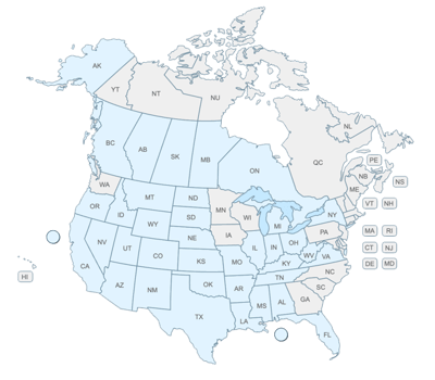
The industry didn't start with unconventionals and neither does our data. We cover the full historical dataset across every producing state and province. Don't settle for inferior data, check out our coverage for any state or province you're interested in.

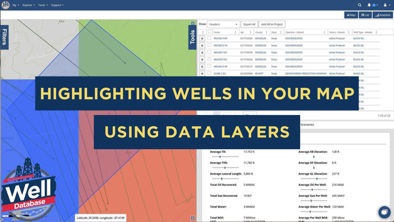
Facing a challenge in creating captivating visual maps for your presentation? We are here to help you look like the rockstar you are in front of your audience. If you don't have experience in GIS or access to an expensive mapping program, WellDatabase can help you create stunning and dynamic maps that will leave a lasting impression on your audience.
 Remember those days of using ancient road atlases and push pins for visuals? With WellDatabase's slick mapping tools, you can effortlessly create visually appealing maps in just a few minutes. We will guide you through using standard overlays and data layers to turn a basic map into a wealth of information.
Data layers are a visual map representation and will never appear in analytics. They can be visualized either as well spots or to highlight hot spots using a heat map, grid map, or choropleth map. Using data layers can take your analysis to the next level, delivering dynamic and customizable information. This tool allows you to uncover insights and navigate your area of interest with precision and efficiency.
WellDatabase offers a wide range of standard overlays, which are undoubtedly impressive, but the real showstopper is the data layer, standing out for its exceptional power and versatility. Unlike a typical shape overlay, a data layer provides dynamic information that can be customized to meet your specific needs. With a data layer, you can view data in a way that is most meaningful to you.
One of the key advantages of a data layer is its ability to direct you straight to the heart of the matter. A data layer lets you quickly and efficiently identify crucial information by pinpointing hot spots within your area of interest. Whether analyzing trends or assessing potential risks, a data layer can guide you directly to the most critical areas.
A data layer sets you free to explore and interpret data your way. It equips you with insights to make informed decisions based on your unique perspective. By leveraging the dynamic nature of data layers, you can unlock valuable information and uncover hidden patterns or correlations that may have otherwise gone unnoticed.
We will combine both types of layers in a real-world example.
Let's dive into some exciting additions to the map that will transform your wells from basic proximity to each other into an eye-opening visualization.
We can make these enhancements effortlessly with a few simple clicks on the WellDatabase platform.
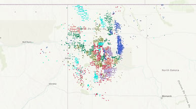
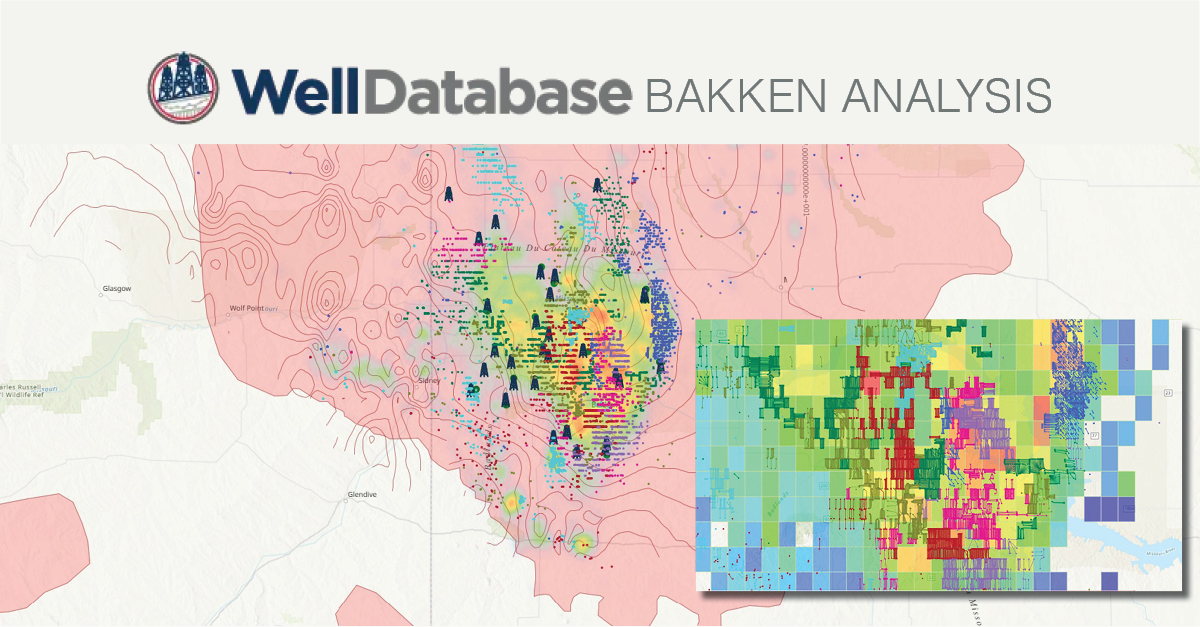
 Let's narrow our focus to the operators of interest in the Bakken to kick things off and keep the base map tucked away for now. While this gives us a clear view of how each operator's wells are related spatially, we'll need a little more pizzazz to wow our audience with an impressive presentation.
 Then, with just two clicks, we can add some map depth.
Switch the base map to the terrain, and voila!
Cities, states, and other landmarks will provide more insightful relational data.
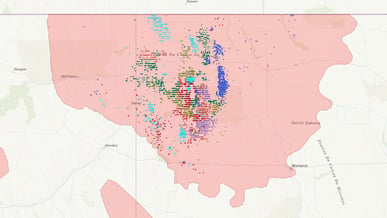
Now, let's take our map up a notch by adding the US Shale Play overlay. This shape will reveal the boundaries of the Bakken play (as well as the other plays across the United States).
If you're new to adding overlays, we've got you covered with a helpful article to get you started: How to add WDB Overlays
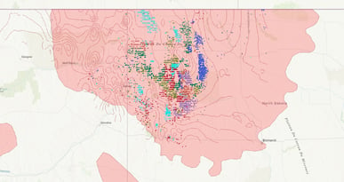
We can even throw in the Bakken Isopach overlay to showcase the distribution of rock thickness.
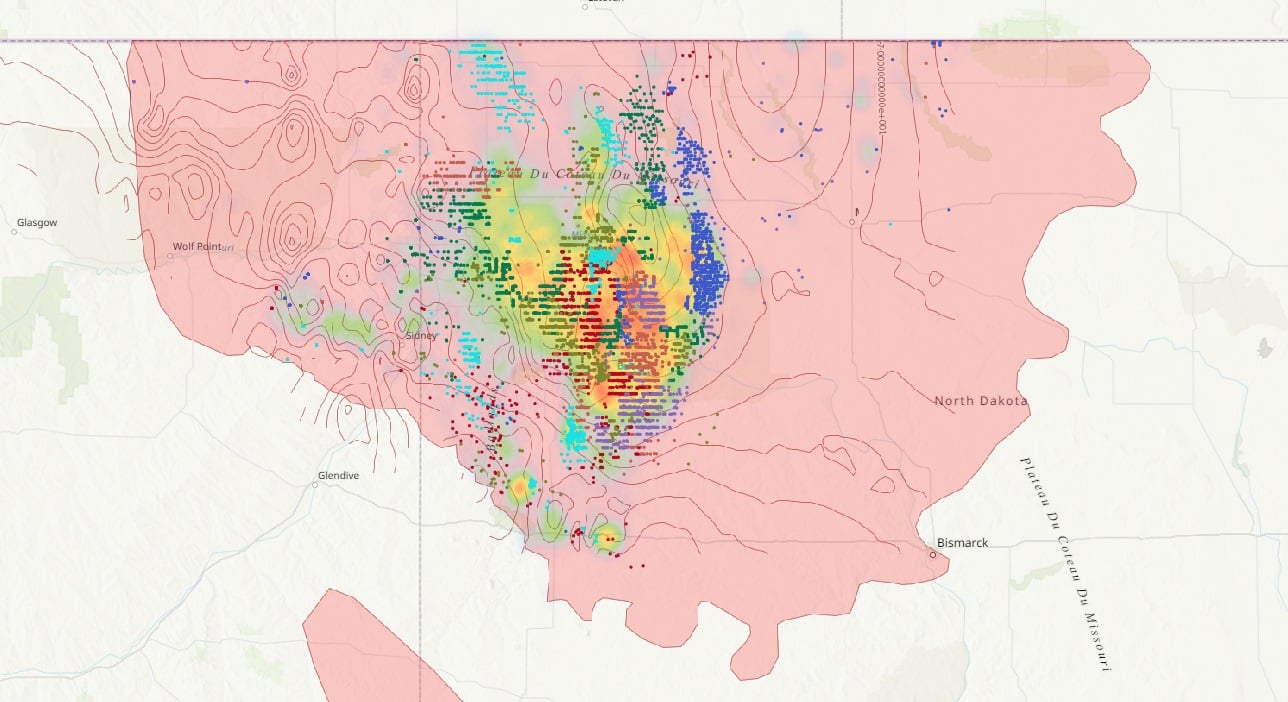
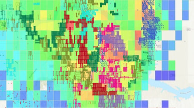
Now that we have some basic shapes added to our map let's move into the dynamic data layer, creating a heat map. The heat map is a 5-year EUR based on CUM oil since 2010 in the Bakken. This allows us to visualize the highest EUR expected in this area, which of our operators are in the heart of it, and which ones are looking in from the sidelines.
To create a secondary map:
Once you've tweaked your map to your heart's content, some operator's well spot colors blend into the background. Take those salmon-colored wells in the grid map above, for instance. They're practically camouflaged!
 One of the great things about the WellDatabase platform is that you can customize practically everything, including the colors of the well spots. You can personalize your map and make it your own. Navigate to: How to change the well spots color to learn more.
Explore more about data layers in the following articles:
Don't forget the rig layer! With this feature, you can showcase the real-time locations of rigs across the entire United States on your map. It's a fantastic way to add more depth and context to your presentation. Learn how to in this article.
With your presentation-ready map in hand, WellDatabase gives you the ability to generate a PDF or an Image of your map, with sizes ranging from Letter (8.5”x11”) to Arch D (24”x36”). Read more: How to Export/Print a Map
In addition to printing a physical or digital version of the map you've created, there are numerous ways to enhance your presentation and captivate your audience. One effective method is to incorporate charts generated from our analytics. Doing so impresses your audience and provides them with valuable data-driven insights. These charts represent the information gathered, making it easier for your audience to understand and interpret the data Click here to dive deeper into analytics.
Are you ready to get started with your map and leave a lasting impression?
If you are intrigued by what you've just read here and not yet part of the WellDatabase community, click here to compare our plans. Start a free trial on the plan that matches your needs, and get ready to experience the wonders of WellDatabase firsthand!
1 min read
We are always looking for ways to increase our users experience and add more functionality, without increasing pricing. WellDatabase 23.1 is packed...
.png)
1 min read
In the oil and gas industry, data visualization is a game-changer. It empowers operators to make faster, smarter decisions by combining complex...
1 min read
In today's ever-changing world of oil and gas exploration, having a good handle on well data is crucial for making smart choices. WellDatabase has...