 Avis Blackburn
1 min read
Going Too Far With Map Layers
In the oil and gas industry, data visualization is a game-changer. It empowers operators to make faster, smarter decisions by combining complex...


The industry didn't start with unconventionals and neither does our data. We cover the full historical dataset across every producing state and province. Don't settle for inferior data, check out our coverage for any state or province you're interested in.
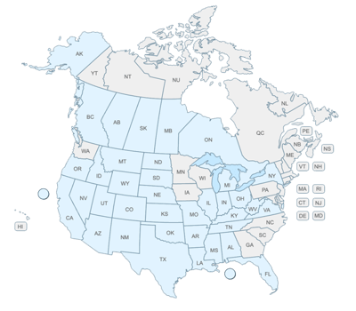

Customize your map with overlays, data layers, a dynamic rig layer, and more for better map visualization digitally or in print.
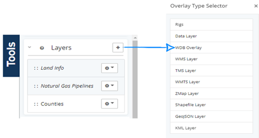
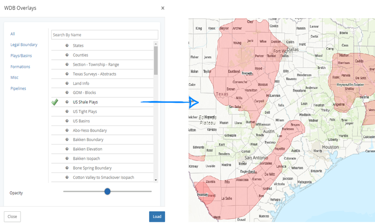
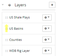
WDB Overlays has over 60 different layers to add to a map singularly or stacked. On the tools menu, all the selected overlays (active and hidden) are displayed. The options that are grayed out and italicized below are layers that are currently hidden, but not removed so they can be easily accessed later. For this example, I only want to see Counties and US Shale Plays.
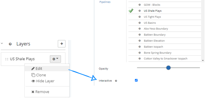
To add a WellDatabase preloaded overlay, such as US Shale Plays:

Choosing US Shale Plays will add a single overlay that has all the shale plays properly placed to your map. You can also change the opacity for each layer you select.
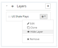
To hide or remove a layer, click the gear dropdown next to the layer you no longer wish to see on your map. If it’s a layer you use often, consider hiding it over removing it.
This is a dynamic layer, new to Version 23.1, which places current (or historic) rigs directly on the map area and is updated weekly.

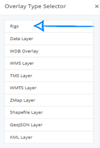
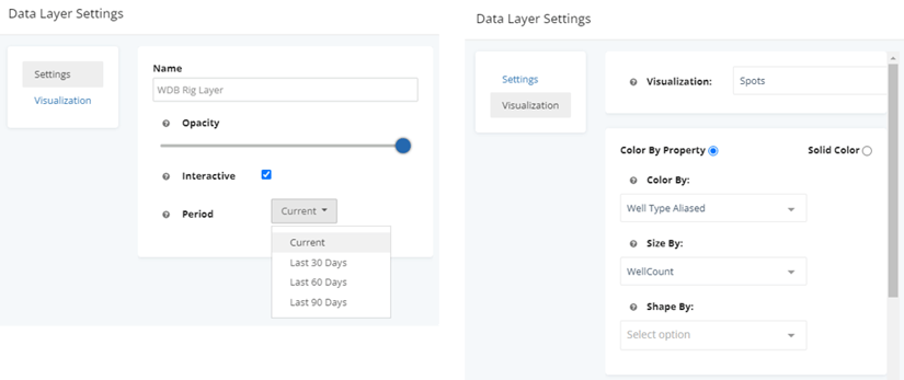
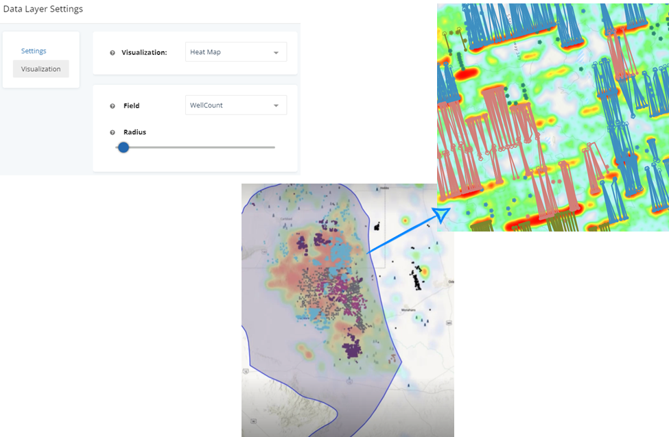
The settings and visualization can each be adjusted.
Once Rigs have been added as a data layer, the current rig locations across the US will show up throughout the map – regardless of the filters that have been chosen. Left click on any of the rig spots for more details.
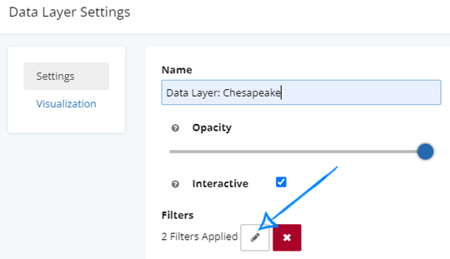
Search filters are the default data layer on the map. However, using the overlay for a data layer allows users to compare two datasets that are not directly related, with only the search filtered attributes visible in analytics. Data layers are a visual map representation only and will never appear in analytics.
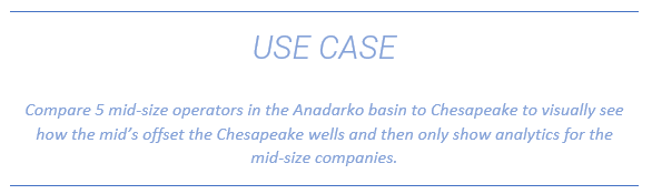
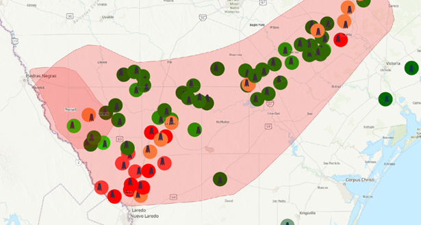
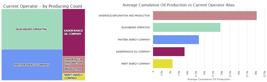
Since Chesapeake has such a large stake in the Anadarko basin, including this company in the search analytics – their numbers over power any analytics charts. Since we want to see their well placement in comparison to 5 mid-size companies, we will add a data layer for Chesapeake so they appear on the map but not in the analytics.
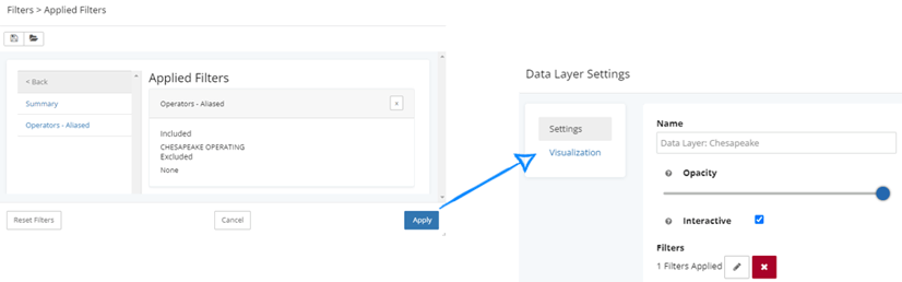
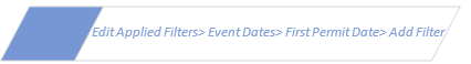
Clicking the edit pencil will open the applied filters screen and give a summary of which filters are currently applied. Remove any unwanted applied filters.

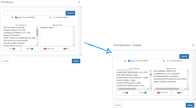
After selecting Operators-Aliased, search for the desired company and click add. Once the company appears in the selected items, click add filter.
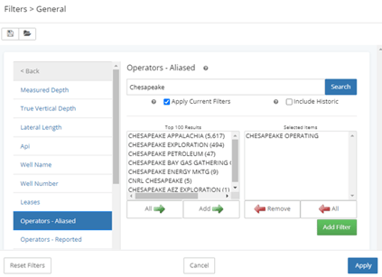
Once the correct filters appear in the applied filters, click apply and the Data Layer Settings screen will pop up.
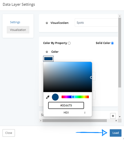
Before we complete this task and load the filter, we will normalize the color to make these wells standout as their own entity, by clicking the visualization tab.
For this data layer, we want to show all of Chesapeake’s wells as one color regardless of the type of well. Choose solid color – and then edit the color. Selected below is the HEX code for Chesapeake’s blue. Size and shape of the well spots can be edited using the additional filters, but for this example – we only adjusted the color. Once the setting is correct – click load.
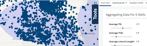
Now that the data layer has been applied, the well spots are on the map in the color we selected, however, the analytics are not picking up any wells in the search area. Which is what we want when using this method of data layers versus the search filters.
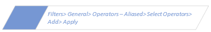
Apply the search filters:

Add Anadarko basin and click apply. Repeat to select the mid-size operators.
The legend below shows the companies from the primary search – which analytics are aggregating data for, as well as the data layer that we added for Chesapeake.
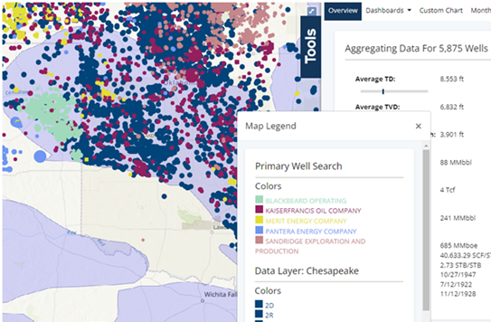
While visually we can see Chesapeake on the map, their data will not apply to any of the analytics. All dashboards will be reporting only on data from the 5 selected companies creating an easier comparison of these companies.
When adding multiple levels to a map, users can adjust which level is on top. If a layer appears hidden either try adjusting the opacity of one of the layers or click and hold between the :: and drag a layer to the top of the list.
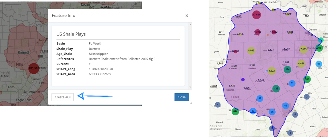
Activating an interactive layer allows this layer on the map to be clicked on to provide more information about the boundary or to create a new area of interest with this shape. As a best practice, only have one layer interactive at a time.

Clicking on a shape boundary on the map will allow the option to create an AOI and limit the search filters to this area.
To remove this area of interest:

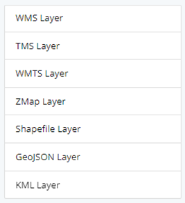
With the new built in overlays, if the WellDatabase library doesn’t have the desired overlay or shape, users are still able to upload their own layer using in the following formats:
The difference between these two layers is well layer settings applies to map attributes based on search filters and will be calculated in analytics while data layers is only a visual representation of the filters added as a layer on the map with no analytics. Keep in mind as we explore the different map types available, that these can be applied through data layers or the default map layer.
The default map well layer is always an interactive layer, whereas data layers users have the choice whether to make that layer interactive or to leave inactive.
Navigate to visualization settings in data layers:

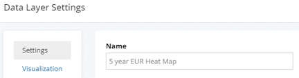
When using multiple data layers, rename each data layer specific to the search parameters.
Navigate to visualization settings in well layer settings:

Maps default with a standard hot/cold color scheme. Easily change the default by clicking the color under gradient and selecting new colors.
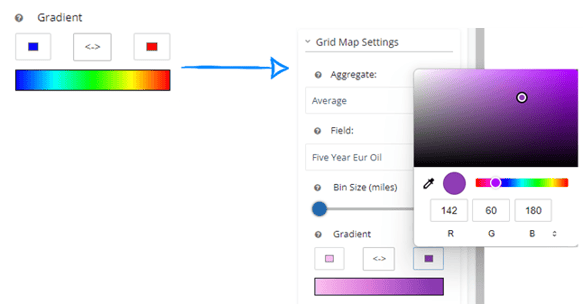
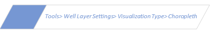
Choropleth maps can easily highlight the highest and lowest producing areas in the map search based on county, state or basin. For this example, we have targeted cum oil by county in Oklahoma. In your tools bar, change start by changing your visualization type to Choropleth Map, then adjust the settings. Use this same method to quickly identify permits over time, EUR, or any other data point that you are looking to compare a high/low in a quick visual representation.
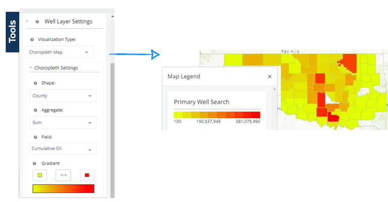
Right-click on any of the counties for more details or to create a new area of interest. Select Create AOI to limit your results to a single county and well database will create a custom area of interest.
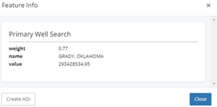
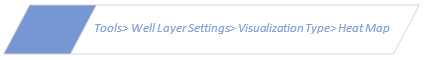
Whereas the choropleth map shows the Grady County to have one of the highest levels of cum oil production in Oklahoma, the entire county may or may not add to this volume. Try switching the visualization type to heat maps to further examine the highest producing areas inside of this county.
To remove the county AOI, use your filters to change area of interest back to map bounds or none.
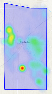
Consider using a heat map through data layers combined with well spots on in the well layer settings to show a visual representation of a targeted volume or event-based activity. In the example below, the well spots have been narrowed to only specific operators, whereas the added heat map did not limit the operators in the search applied. Since the heat map is searching for all permits regardless of operator, there will be places on the map where there is a heat radius without a well spot.

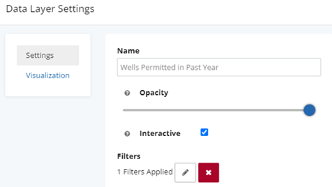
Change visualization to heat map and adjust the radius size. Then click load. As a data layer, we are now able to visually see permits in the past year at the well sites.
These tools have been around for a while, but are not well know features from the map.

Right clicking on the map area will bring up multiple options, including the measuring tools. You can also clear measurements from this screen too, if you have any remaining on your map from a previous session.
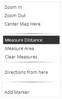
Selected measure distance (or area) and a new tool bar will be placed at the top of the screen.
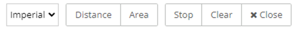
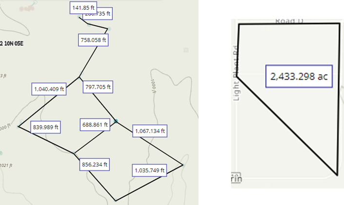
Measure distance between wells or areas of interest by placing the curser on the start point and left click. Repeat this for each desired measurement. This example shows the distance between all the wells in an area for a specific operator. The same method could be used to find total acreage by clicking area instead of distance. Once all the measurements are gathered, either stop and close to keep these on the map or clear it before closing.
Measure Distance vs Measure Area

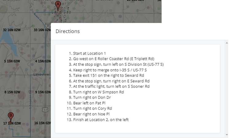
Easily find directions from one well to another directly from the map. Right click on the spot on the map start point and choose directions from here. A new marker will be added to the map for the beginning destination. Then right click on the end destination and select directions to here, a second marker will be added, and the driving directions will pop up.

In the example below, two company’s colors are similar – making it difficult to visually differentiate between them.
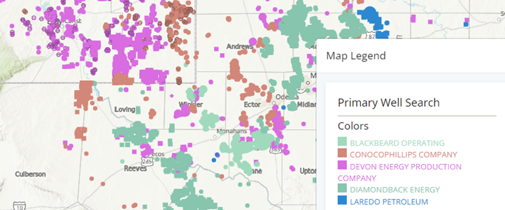
To change the colors on one or more operators, move over to the analytics tab. Pull up a chart that is grouped by Operator and left click the company pie piece to change its color. Then select change color from the dropdown.
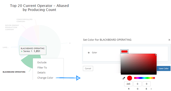
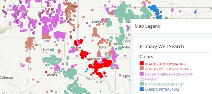
Now, Blackbeard Operating and Diamondback Energy are easy to differentiate between.
We hope you find this blog a useful tool to do more with your mapping, and understand some of the new features. If you have additional questions, email us: support@welldatabase.com
.png)
1 min read
In the oil and gas industry, data visualization is a game-changer. It empowers operators to make faster, smarter decisions by combining complex...
1 min read
Facing a challenge in creating captivating visual maps for your presentation? We are here to help you look like the rockstar you are in front of your...

1 min read
Understanding production patterns and identifying hotspots in oil and gas analytics is crucial for strategic decision-making. Here are some advanced...