1 min read
Customizing Your Map - Color By Properties
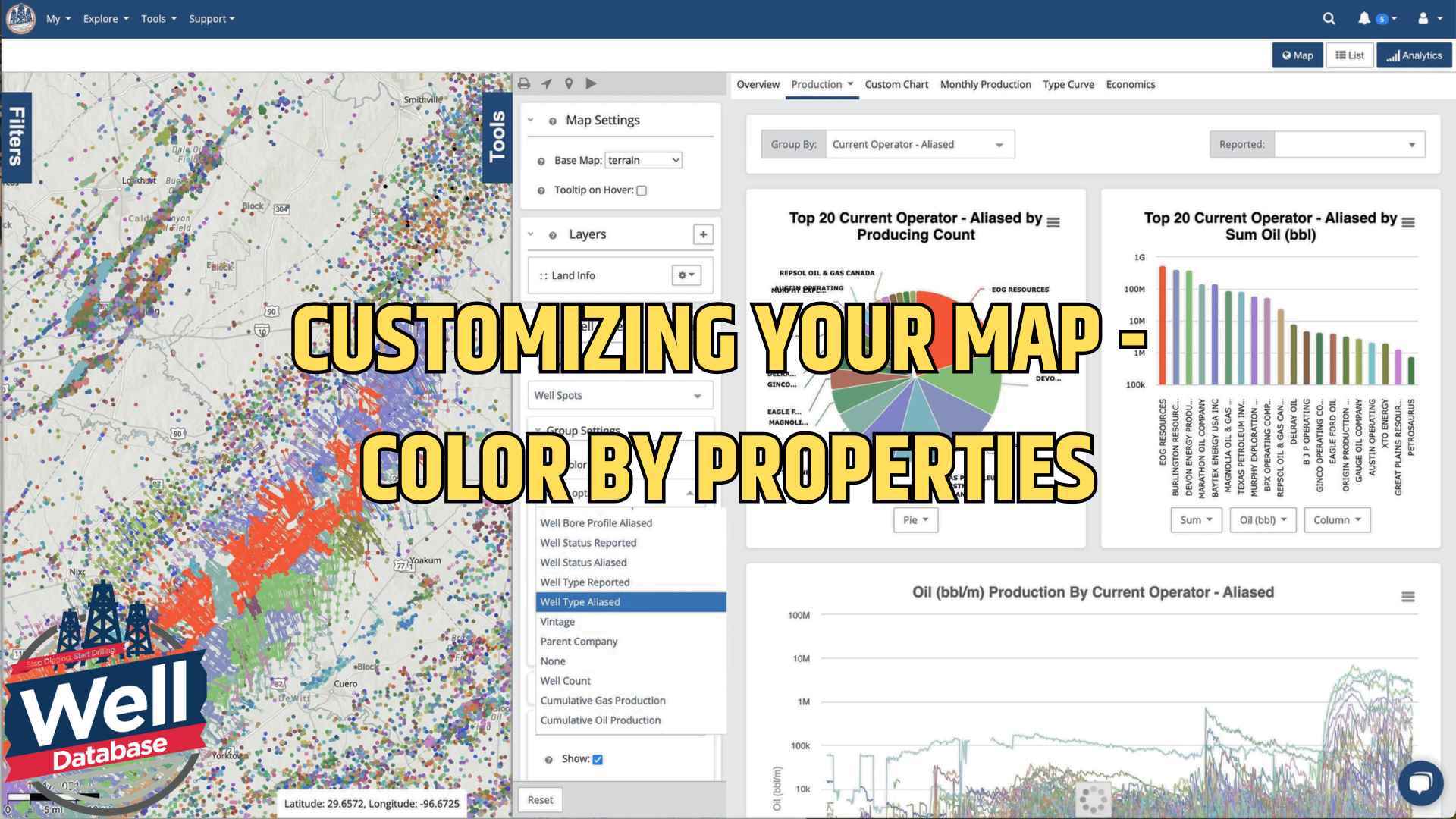
Let me introduce you to one of our most powerful yet user-friendly features: map color customization. Whether you're analyzing well locations,...
You need data. You need mapping. You need tools to analyze that data. Now you can do everything in a single, easy to use platform.
Perfect for users who need access to basic well level data. If you're only interested in a few wells and currently use state sites, this plan is for you.
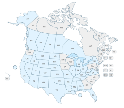
The industry didn't start with unconventionals and neither does our data. We cover the full historical dataset across every producing state and province. Don't settle for inferior data, check out our coverage for any state or province you're interested in.

1 min read
John Ferrell
:
Dec 5, 2024 1:48:26 PM

Understanding production patterns and identifying hotspots in oil and gas analytics is crucial for strategic decision-making. Here are some advanced mapping features that are transforming how we visualize and analyze well data.
These features—available to Plus and Pro account holders—provide valuable insights for anyone interested in comprehensive well analysis. We'll explore a practical example using the Eagleford area to demonstrate these capabilities.
A key feature is the ability to create sophisticated data layers for comparing different well subsets against overall production data. This proves especially valuable when identifying production variances and 20-year EUR hotspots in your area of interest.
Here's how to create an insightful production analysis layer:
Start with the Right Data Set
Begin by establishing a solid background layer. In the Eagleford area, wells since 2010 have provided the most relevant dataset, which is when activity began showing notable patterns in the region.
Refine Your Selection
For the most accurate analysis, filter specifically for horizontal wells. This eliminates noise from older vertical wells that could skew our understanding of current production patterns.
Create Your Data Layer
The transformation occurs when you convert your filtered selection into a data layer. This creates a separate visualization with its own interactive properties while working seamlessly with your primary layer. This approach lets you maintain multiple perspectives simultaneously without interfering with your main working layer.
Customize Your Visualization
The EUR map offers particularly useful visualization. When setting this up, consider these key factors:
The portal's true strength lies in its flexibility. The heat map scale adjusts dynamically as you zoom in and out, providing context-appropriate visualization at every level. This proves invaluable when identifying production patterns across different geographical scales.
 Though this toolset may appear complex initially, its value becomes clear when making data-driven decisions about well placement, production optimization, or asset evaluation. The ability to layer different datasets and visualize them meaningfully transforms raw data into actionable insights.
Whether you're analyzing EUR patterns, comparing well performance, or identifying production hotspots, these tools will give you the flexibility and insight you need to make informed decisions.

1 min read
Let me introduce you to one of our most powerful yet user-friendly features: map color customization. Whether you're analyzing well locations,...

1 min read
We’ve been discussing all things production and how they pertain to the current market. If you haven’t read the first parts yet, here are the links

1 min read
We get asked all the time about the method we use to allocate Texas production data. For those who might not know, Texas requires operators to report...