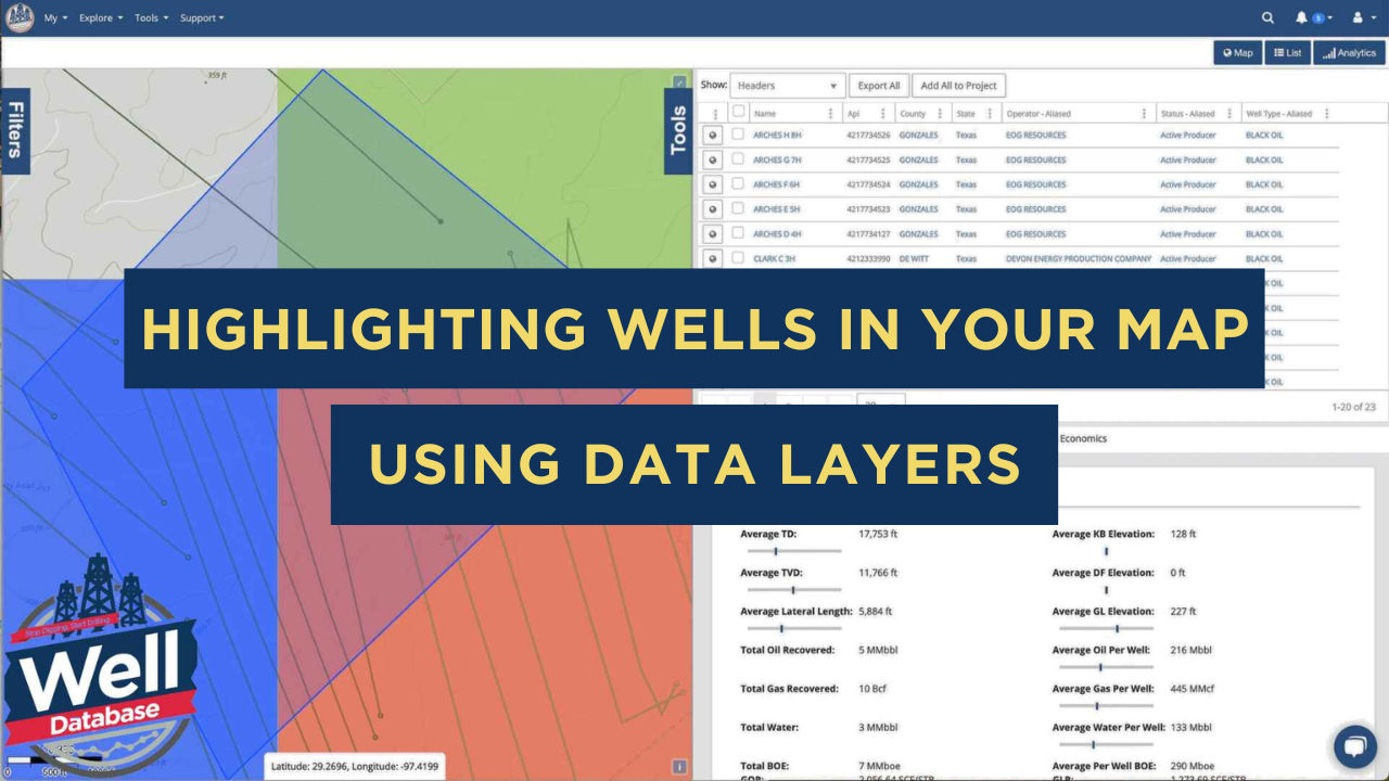
Highlighting Wells In Your Map Using Data Layers
In today's ever-changing world of oil and gas exploration, having a good handle on well data is crucial for making smart choices. WellDatabase has...
You need data. You need mapping. You need tools to analyze that data. Now you can do everything in a single, easy to use platform.
Perfect for users who need access to basic well level data. If you're only interested in a few wells and currently use state sites, this plan is for you.
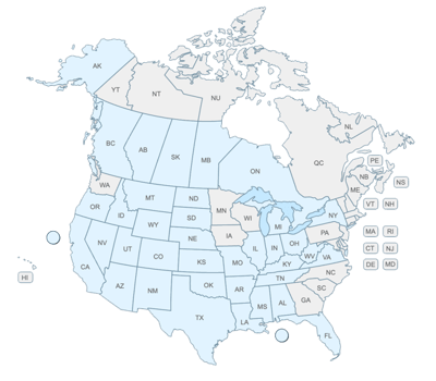
The industry didn't start with unconventionals and neither does our data. We cover the full historical dataset across every producing state and province. Don't settle for inferior data, check out our coverage for any state or province you're interested in.


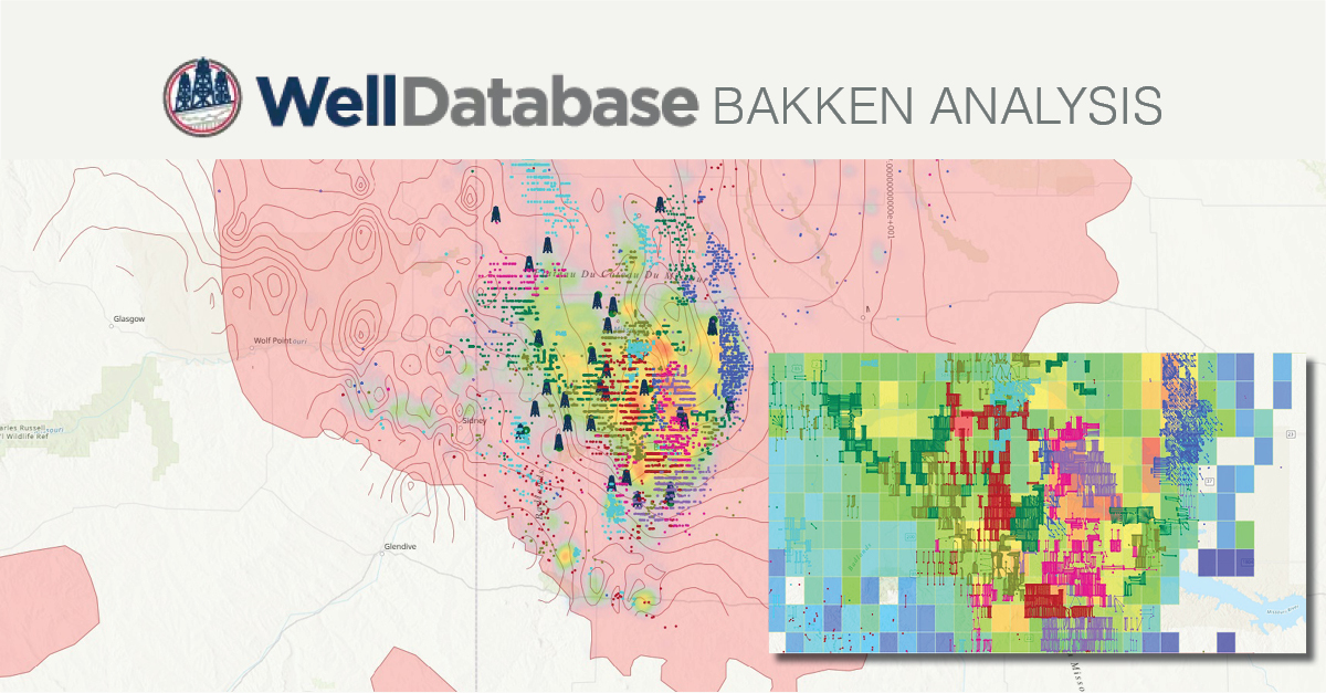
In the oil and gas industry, data visualization is a game-changer. It empowers operators to make faster, smarter decisions by combining complex datasets into a clear, actionable format. Layering multiple datasets on a single map has become essential—and in this video, we explore just how far you can push those layers. Spoiler alert: we had a little fun with it.
Our advanced mapping system integrates three powerful tools to deliver a comprehensive view of your data:
20-Year EUR Grid
Provides essential historical context, showing regional well performance over two decades.
Target Well Highlighting
Makes key assets instantly identifiable, so you can focus on what matters most.
EUR Half-Month Heat Map
A favorite among financial analysts, this visualization reveals how quickly wells reach half their Estimated Ultimate Recovery (EUR), helping to identify efficiency trends and potential sweet spots.
Striking the Perfect Balance
Layering isn’t just about stacking data—it’s about thoughtful design. At WellDatabase, we carefully balance layer hierarchy and transparency, ensuring that every insight remains visible and accessible. With flexible filters, customizable settings, and tailored layer arrangements, you can create maps that suit your unique analytical needs.
Smarter Visualizations, Better Decisions
These advanced visualization tools give operators a richer, more nuanced understanding of field performance. By integrating historical trends, asset targeting, and production metrics, WellDatabase makes it easier to uncover patterns, optimize resource allocation, and guide development decisions.
Why stop at one layer when you can have them all? Explore the possibilities with WellDatabase and see how data visualization can take your decision-making to the next level.

In today's ever-changing world of oil and gas exploration, having a good handle on well data is crucial for making smart choices. WellDatabase has...

Facing a challenge in creating captivating visual maps for your presentation? We are here to help you look like the rockstar you are in front of your...

Understanding production patterns and identifying hotspots in oil and gas analytics is crucial for strategic decision-making. Here are some advanced...