1 min read
Going Too Far With Map Layers
In the oil and gas industry, data visualization is a game-changer. It empowers operators to make faster, smarter decisions by combining complex...
You need data. You need mapping. You need tools to analyze that data. Now you can do everything in a single, easy to use platform.
Perfect for users who need access to basic well level data. If you're only interested in a few wells and currently use state sites, this plan is for you.
The industry didn't start with unconventionals and neither does our data. We cover the full historical dataset across every producing state and province. Don't settle for inferior data, check out our coverage for any state or province you're interested in.


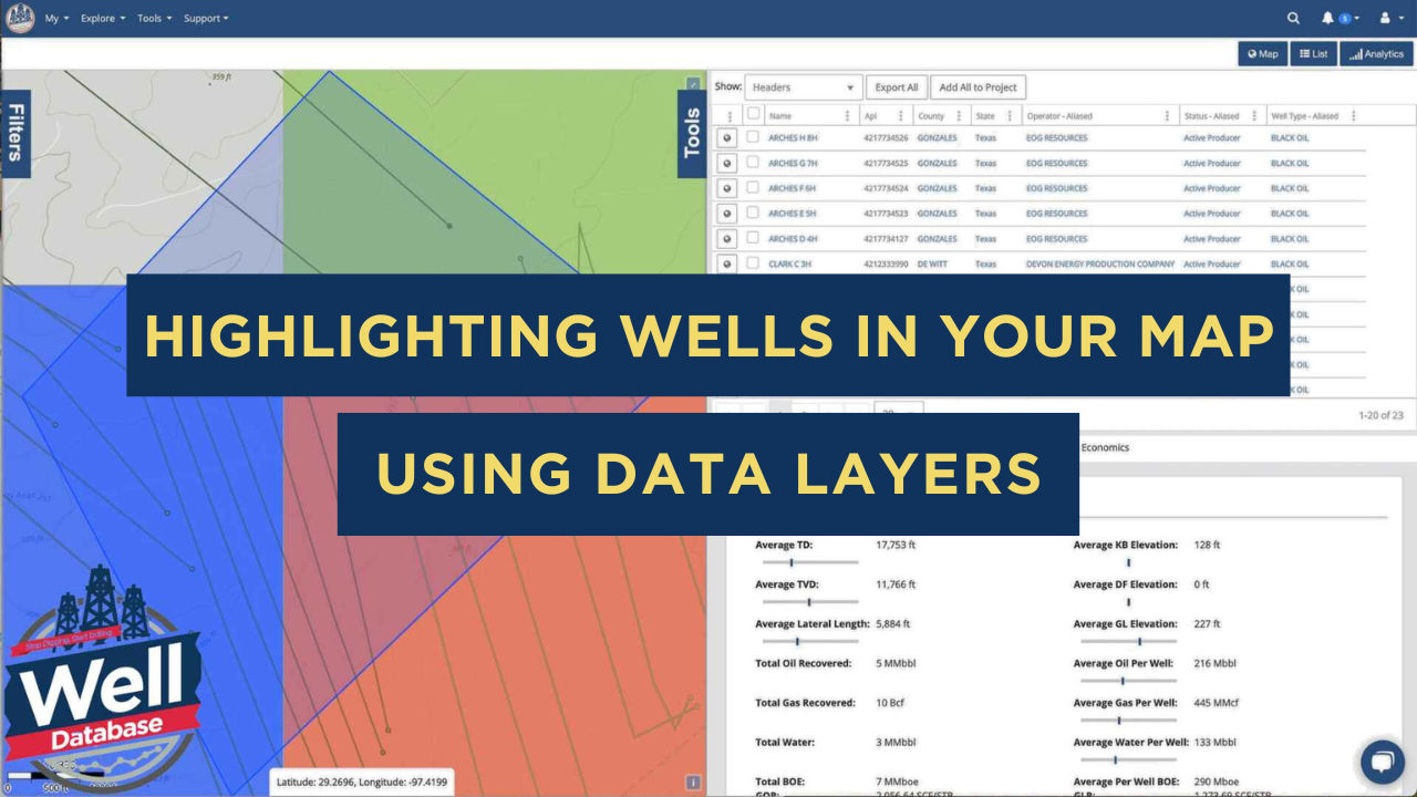
In today's ever-changing world of oil and gas exploration, having a good handle on well data is crucial for making smart choices. WellDatabase has developed a cool new way to visualize wells that will change how engineers and analysts work with their data.
This visualization technique adds unique highlighting effects to selected wells, making it easy for you to zero in on specific targets while checking out the surrounding assets. It's super handy for analyzing well performance and creating type curves across different regions.
You can select target wells through multiple methods—using a polygon tool for manual selection, importing API lists, or utilizing shapefiles. This flexibility makes it easy to incorporate existing datasets into the visualization workflow.
Selected wells can be converted into a dedicated data layer, a persistent visual reference throughout the analysis. A key feature is the "halo effect" around selected wells, ensuring they remain easily identifiable across different zoom levels and map perspectives.
The visualization system offers precise control over the appearance of highlighted wells. You can:
Our highlighting system fits right in with other analysis tools, like: 
When diving into complex datasets, the portal shines. Engineers can easily monitor their target wells while also checking out the surrounding assets and crafting type curves. This helps you spot all the important spatial relationships and performance trends.
Feel free to tweak other data layers and filters while keeping those highlighted wells as a handy, non-interactive background layer. This way, you can focus on key assets while fully understanding the broader well landscape.
This new visualization technique is a big step in making well data easier to access and use. By blending intuitive visual cues with powerful analysis tools, WellDatabase has crafted a solution that boosts the efficiency and accuracy of well analysis workflows.
This approach is a fantastic option for exploration and production companies looking to fine-tune their well analysis processes. It smoothly connects data accessibility with actionable insights.
.png)
1 min read
In the oil and gas industry, data visualization is a game-changer. It empowers operators to make faster, smarter decisions by combining complex...

1 min read
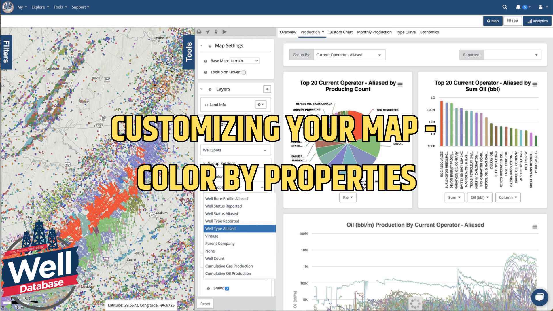
Let me introduce you to one of our most powerful yet user-friendly features: map color customization. Whether you're analyzing well locations,...

1 min read
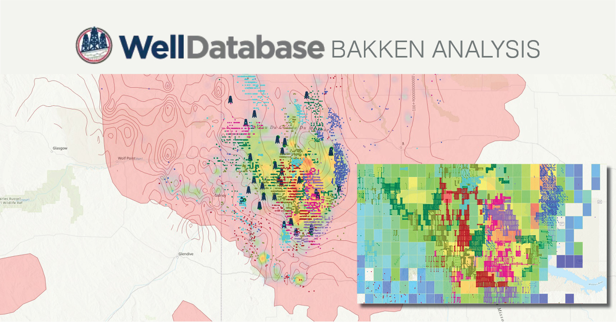
Facing a challenge in creating captivating visual maps for your presentation? We are here to help you look like the rockstar you are in front of your...