Highlighting Wells In Your Map Using Data Layers
In today's ever-changing world of oil and gas exploration, having a good handle on well data is crucial for making smart choices. WellDatabase has...
You need data. You need mapping. You need tools to analyze that data. Now you can do everything in a single, easy to use platform.
Perfect for users who need access to basic well level data. If you're only interested in a few wells and currently use state sites, this plan is for you.
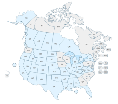
The industry didn't start with unconventionals and neither does our data. We cover the full historical dataset across every producing state and province. Don't settle for inferior data, check out our coverage for any state or province you're interested in.


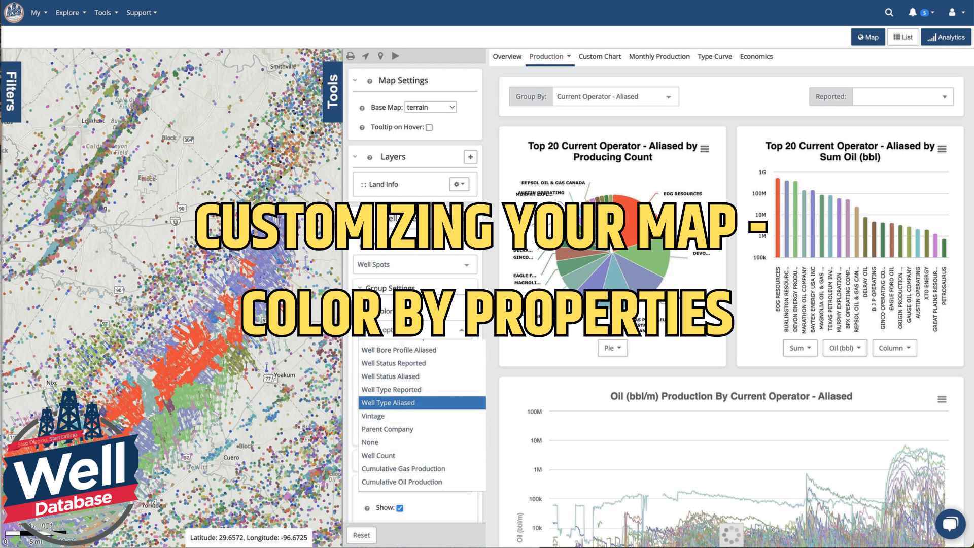
Let me introduce you to one of our most powerful yet user-friendly features: map color customization. Whether you're analyzing well locations, comparing operators, or studying field production, this tool will help you visualize data more effectively.
The color customization feature is included in our Essential plan and higher tiers. While Lite users need to upgrade to access this feature, Essential users can immediately start using these visualization tools. Plus, Pro, and Enterprise plans offer additional benefits, including shape and size customization.
The process is simple: Open the tools menu, locate the Well Spots visualization type in our Well Layer, and select the "Color By" option to select from various properties for your view.
Here's a practical example: by selecting "Current Operator Alias" as your color parameter you will instantly see how different operators' wells are distributed across your map. This view is especially useful for understanding operator positions and analyzing offset wells.
The color customization feature offers several ways to analyze your data:
A key strength of our color customization tool is its flexibility. You can adjust default colors to create clearer visualizations. For instance, you can easily change one to improve contrast if two categories share similar colors.
Even better, your color settings save automatically. Once you customize a color for a specific operator or category, it stays consistent in future sessions, helping you maintain a standardized approach across your analysis.
Color customization truly helps you understand complex data relationships at a glance. Whether you're analyzing well statuses, comparing operator positions, or studying field production, visualizing these differences through color will streamline your workflow and improve your decision-making.
Ready to start customizing your maps? Log into your WellDatabase account and try these features yourself. Remember, upgrading to Essential will unlock these visualization tools and much more if you're a Lite user.

In today's ever-changing world of oil and gas exploration, having a good handle on well data is crucial for making smart choices. WellDatabase has...

Facing a challenge in creating captivating visual maps for your presentation? We are here to help you look like the rockstar you are in front of your...

In the oil and gas industry, data visualization is a game-changer. It empowers operators to make faster, smarter decisions by combining complex...