1 min read
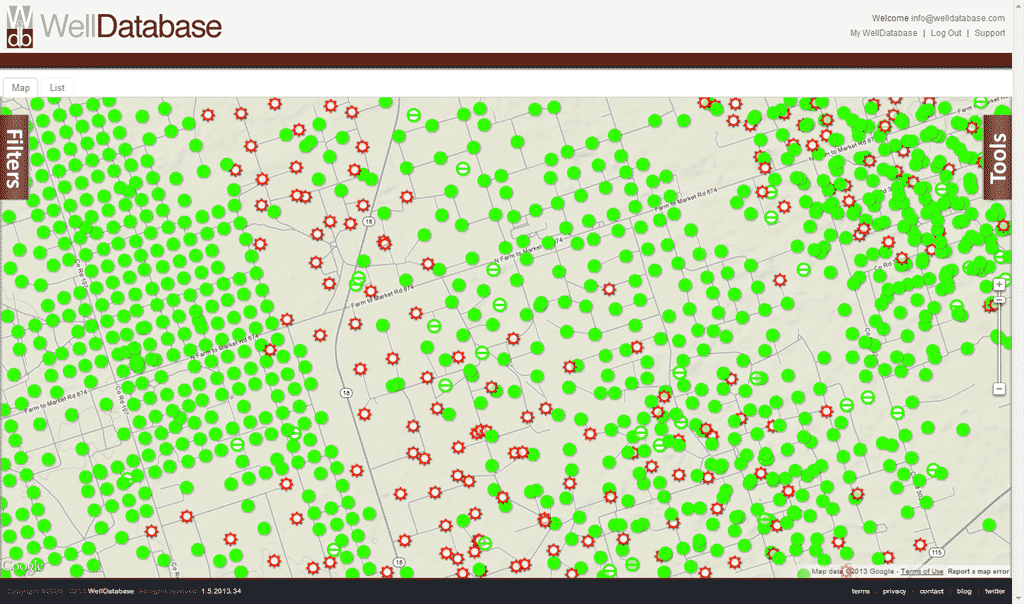
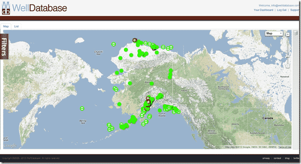
The WellDatabase Map
In our previous posts we covered searching in both the web application and the mobile application. Today we are continuing with our series on using ...
You need data. You need mapping. You need tools to analyze that data. Now you can do everything in a single, easy to use platform.
Perfect for users who need access to basic well level data. If you're only interested in a few wells and currently use state sites, this plan is for you.
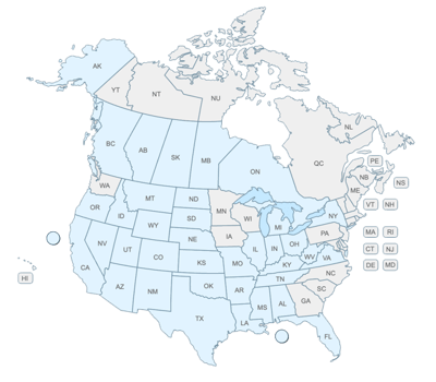
The industry didn't start with unconventionals and neither does our data. We cover the full historical dataset across every producing state and province. Don't settle for inferior data, check out our coverage for any state or province you're interested in.
We’ve been hard at work here at WellDatabase. We are constantly updating our platform to provide the best possible tools and data. The latest target – Decline Curve Analysis.
Our decline curve analysis tool has been wildly popular. Customers love how easy it is to fit a decline curve to any set of data. There were two requests we were getting often.
In true WellDatabase fashion, we overdid it.
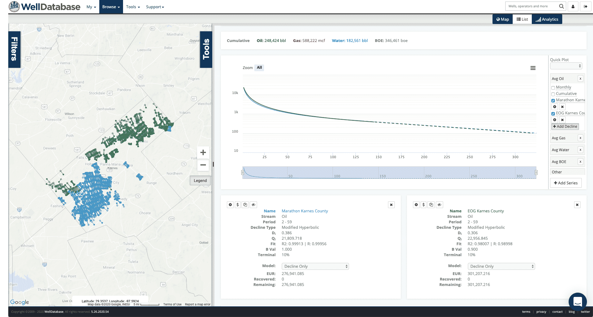
Our latest update blows away the functionality we had before. Our best fit model will incorporate modified declines (where the data supports it). You can generate best fit parameters for any decline type. New decline types include dynamic fit and modified hyperbolic. The new decline summary card gives you instant feedback on fit, b-values, EURs, and more. Here’s a look at what you’ll see.
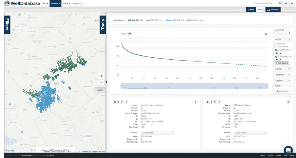
For a close-up of the summary card, they look like this.
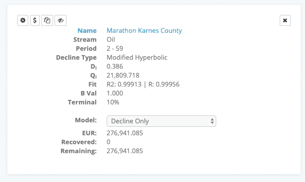
There is a lot there to look at. We will dive into the details of what is there and how it is calculated in a future post. We will also run through a number of workflows (including evaluating shut-ins and comparing operators) on our blog. So keep an eye out for new articles.
One other quick note about this release. You can now add any number of new series’ to the production chart. This includes daily values, P10/50/90, and more. Here’s a quick look at what that.
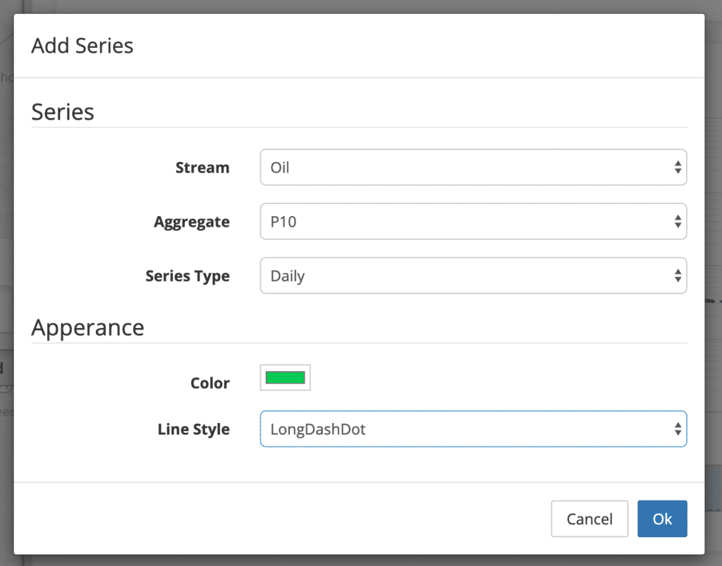
And then the result looks like this
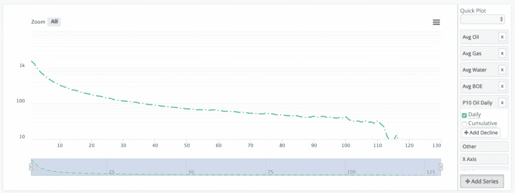
From there you can plot cums or generate a new decline curve analysis from the new curve.
As you can see, this post only scratches the surface with what you can do. We will be following up with a number of posts using this new functionality. If you want to get started and try it for yourself, you can sign up for our Essential plan and get instant access.
1 min read
In our previous posts we covered searching in both the web application and the mobile application. Today we are continuing with our series on using ...
1 min read
This is the next state we come to in our series comparing the state oil & gas information sites to WellDatabase. We will continue to compare the two,...
1 min read
This is the next state we come to in our series comparing the state oil & gas information sites to WellDatabase. We will continue to compare the two,...