 John Ferrell
1 min read
Searching WellDatabase iOS Application
Our WellDatabase iOS app has become one of the most successful oil & gas applications in the Apple App Store. There are several nice oil & gas...


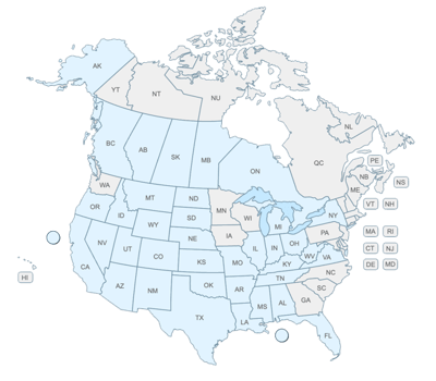
The industry didn't start with unconventionals and neither does our data. We cover the full historical dataset across every producing state and province. Don't settle for inferior data, check out our coverage for any state or province you're interested in.
In our previous posts we covered searching in both the web application and the mobile application. Today we are continuing with our series on using WellDatabase with an overview of the map.
Before we get started, if you have not signed up for WellDatabase yet, you can do so here. Then you can log in and follow along for yourself.
The WellDatabase map is the first map in the industry that allows you to view oil & gas information on a nationwide level. We are able to do this because of our proprietary data normalization process and utilization of the latest GIS technology.
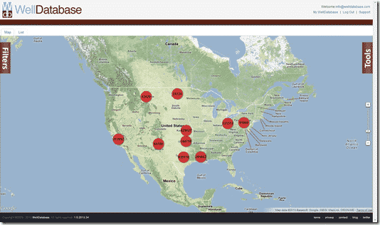
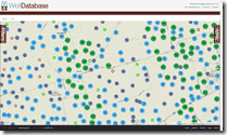
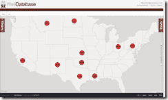
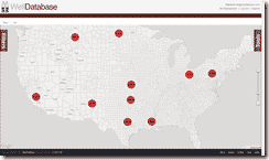
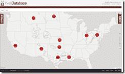
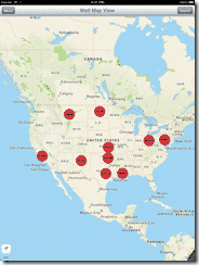
When you open the map you can easily see the entire country with clusters on each state where data is available (Alaska is there, too. Just have to pan over to it.). Our database is growing every day and we expect to have several states coming online in the very near future. Now on to the details of the map.
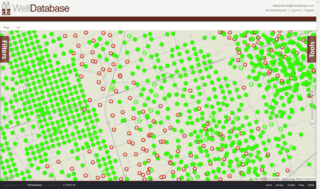
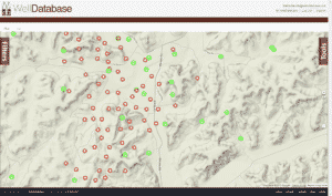
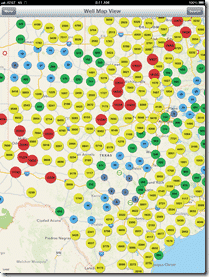
Our database holds millions of wells and in order to present that data in an useful format, we created a clustering system that groups wells by logical bounds. When you start the clusters are by state, but as you zoom in the clusters shift to counties/parishes and then to geographical areas. The clusters are also color coded and list the number of wells included to help spot trends more easily. Keep in mind that the data on map is limited to well information where location data is available. While this is the vast majority of wells, there are still some older wells that do not have location data. Those wells are viewable if you click on the List tab at the top.
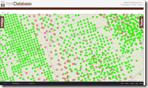
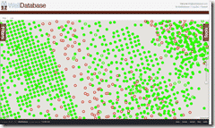
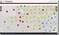
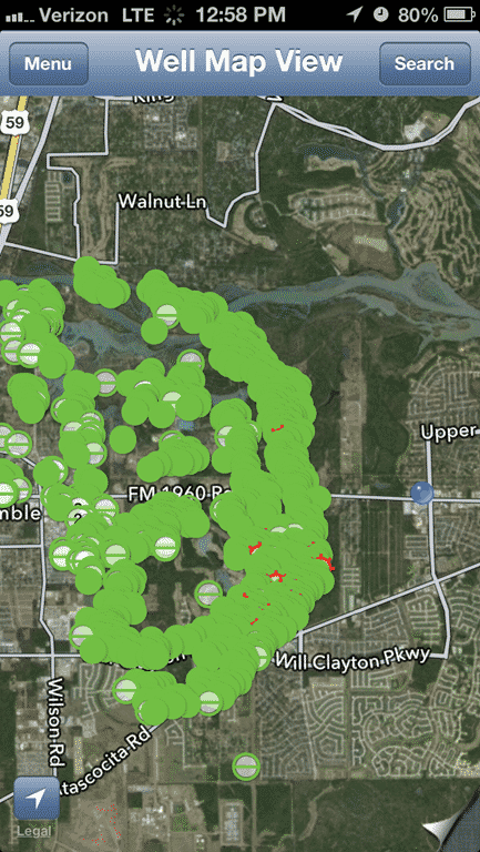
Once you zoom in to a point where there are a manageable number of wells on the screen, the well spots themselves will appear. We defined this point as the place where users would be able to easily differentiate between well spots and actually select wells to view the detail. Limiting the level at which well spots are visible also allows the map to stay responsive. If you want to see well spots at a high level, you can do so by filtering the wells first to decrease the number of wells to be displayed. Searching for something like wells spudded in the past 12 months or only within a particular county will typically return a manageable amount of results that will allow us to show the actual well spots at any level. The well spots generally follow standard well symbols, but here is a legend just for clarity:
| Oil Well | |
| Gas Well | |
| Oil And Gas Well | |
| Gas Storage | |
| Injection Well | |
| Disposal Well | |
| Test Well | |
| Water Well | |
| Sulfur Well | |
| Unknown Well Type |
 Settings
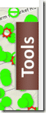
By default the map opens with the Terrain base layer applied and nothing else. This particular view itself is unique and can be useful to operators, but most people will want to see some additional data on the map. This is where our different base maps and overlays come in. To start, you can access layers and all other map tools by clicking on the Tools button on the right side of the map.
The very first thing you may see is the gold marker icon at the top of the map tools. ![]() This button will take you to your current location on the map and drop a marker there for reference. This function will only work with hardware that is GPS capable.
This button will take you to your current location on the map and drop a marker there for reference. This function will only work with hardware that is GPS capable.
The next tool section is the map settings. This is essentially the base map that you work with. The options are Map, Satellite, Hybrid, Terrain, and None. Below are examples of what each one looks like.
 The Map option allows you to see well spots with roads, state boundaries, and water bodies.
The Satellite option shows you a simple satellite image. There are no boundaries or water bodies labeled on this map.
The Hybrid gives you a combination of the Satellite and Map options. This means you will see the satellite image with the items from the Map option on top.
 The Terrain option shows the same items as the Map option, but adds in terrain views. This terrain view creates shadows to give depth and shows elevation lines in certain areas.
The None option allows you to hide all of the base layers and just see the well spots. This option is used primarily in conjunction with the overlays feature that we will discuss next.
The overlays allow you to overlay map information on the map. You can add overlays to any of the map types listed above, but some of them can make seeing the overlay somewhat ![]() difficult. The screenshots below are all with the None option applied so that we can see the overlay more clearly. To
difficult. The screenshots below are all with the None option applied so that we can see the overlay more clearly. To 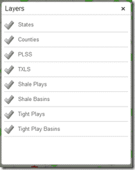 add an overlay, open the Map Tools and click on the green + sign next to the Applied Map Overlays heading. The will pop up the overlays dialog where you can see all of the available overlays and select the ones you would like to add to the map. You can add as many overlays as you would like, but overlapping overlays can hide other overlay data if you are not careful. Fortunately you can order overlays to make sure you are getting the map you need. We will start with single overlays for now.
States – United States state boundaries.
Counties – County / Parish boundaries for the United States. Forgive us people in Louisiana, county is just more prominently used and we didn’t want to put county / parish everywhere.
PLSS – Public Land Survey System. Section, township, & range for those unfamiliar with the PLSS term. For more information, see http://en.wikipedia.org/wiki/Public_Land_Survey_System
TXLS – Texas Land Survey. Texas has a very different survey system but those familiar with it will find this overlay immensely useful.

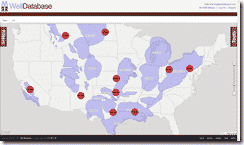
Shale Plays – Overlay of the well known shale plays in the United States.
Shale Basins – The well known shale basins in the United States.
Tight Plays – Well known tight plays in the United States.
Tight Basins – Well known tight basins in the United States.
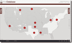
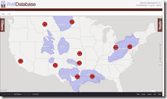
Using multiple overlays is very easy to do as well. Simply check all the overlays you want and then you will be able to manage which order they appear in the well tools. For 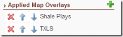 this example we have chosen Shale Plays and TXLS so we can look at the Eagle Ford a little closer. Once we select both of those, the map tools looks like this.
The resulting map can be seen below.
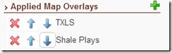 If you were to reorder the overlays (by clicking on the blue arrows) so that that TXLS overlay is above the Shale Plays overlay, the map tools looks like this.
The resulting map looks like this.
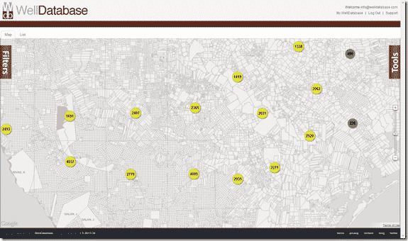
As you can see, the Shale Plays overlay is basically hidden behind the TXLS overlay. This is pretty easy to avoid, just mind the order of the overlays.
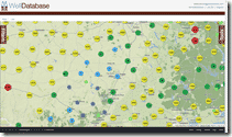
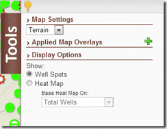
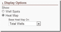 The last feature in the map tools is one of the most unique as well. The heat map function allows you to create heat maps based on properties on the fly. This option is listed under the Display Options section and is defaulted to Well Spots. Once you change the value to Heat map then the dropdown below it becomes active and you can choose the property you would like to base the heat map on.
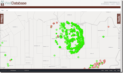
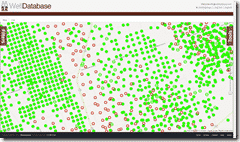
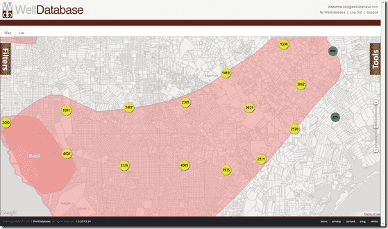
The heat map is pretty straightforward in that it simply maps out the relative values of the property picked for the visible area. That means that red is the highest value for the area you are looking at and then it moves to yellow to green to no color as the value decreases. In our example, we will stay in the Eagle Ford area, leave the TXLS and Shale Plays overlays on and switch on the heat map. The first view is the default heat map based on Total Wells.
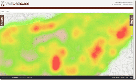
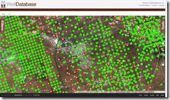
This clearly shows where the wells are and where they are not. Now you can quickly contrast that map with the CUM Oil map below.
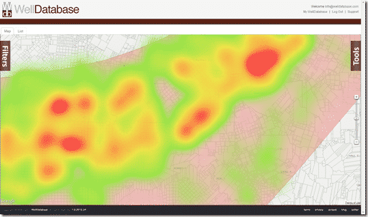
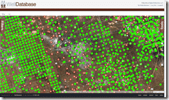
You can easily see that the oil production is more concentrated to the north. If we then switch over to the CUM Gas map…
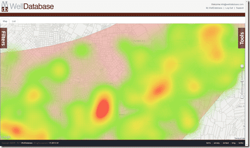
You can see that the wells to the south look to be producing more gas.
You can also use Total Depth and CUM Water as heat map values.
As you can see, our maps at WellDatabase provide a unique user experience that you won’t find anywhere else. When pairing our map tools with our searching capabilities, there is no limit to how you can visualize your data.
If you’re not already a WellDatabase user, sign up here and start using the map today.
As always, feel free to contact us at support@welldatabase.com with any questions or comments.
1 min read
Our WellDatabase iOS app has become one of the most successful oil & gas applications in the Apple App Store. There are several nice oil & gas...
1 min read
With the launch of our iPad application, we wanted to put together a quick rundown on the application and what it can do. Considering the simplicity...
1 min read
Today we are happy to announce that our iPhone application is live and in the app store. The iPad application has been downloaded hundreds of times...