1 min read
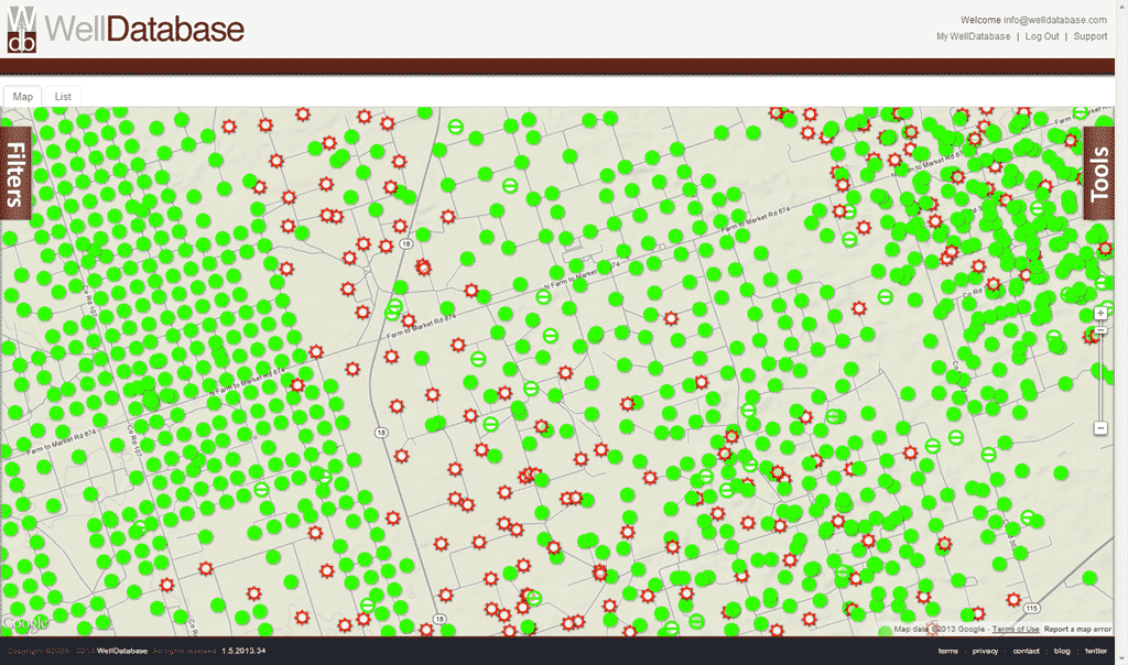
The WellDatabase Map
In our previous posts we covered searching in both the web application and the mobile application. Today we are continuing with our series on using ...
You need data. You need mapping. You need tools to analyze that data. Now you can do everything in a single, easy to use platform.
Perfect for users who need access to basic well level data. If you're only interested in a few wells and currently use state sites, this plan is for you.
The industry didn't start with unconventionals and neither does our data. We cover the full historical dataset across every producing state and province. Don't settle for inferior data, check out our coverage for any state or province you're interested in.


Our WellDatabase iOS app has become one of the most successful oil & gas applications in the Apple App Store. There are several nice oil & gas applications out there, but nothing that even comes close to what WellDatabase is doing. If you have an iPad, iPhone, or even an iPod touch, you can use the link below to download WellDatabase.
https://itunes.apple.com/us/app/welldatabase/id553328644?mt=8
WellDatabase is free to download and just like the site, the different subscription levels will allow you access to different amounts of data. Currently you must sign up on our website before you will be able to access the iOS application. That will be changing shortly with our next release. In the meantime, jump over to https://app.welldatabase.com/signup to create your account.
Our last blog covered searching WellDatabase through the web interface. If you missed it, I highly recommend you go here to read it. This post will cover searching in the iOS application. We have worked hard to create a fluid interface that allows users to easily transition between mobile devices and the web application. Just like we covered in the previous post, WellDatabase offers a massive amount of data and creating a search interface that allows users to easily search our extensive database was a challenge. We gladly accepted this challenge and what we came up with allows users to search for data like never before. This blog will cover both the iPhone and iPad versions of the app since they are using a very similar searching mechanism. There will be plenty screenshots of both.
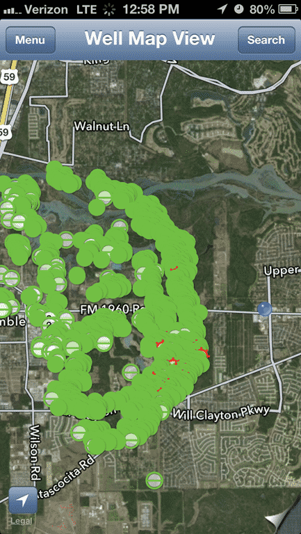
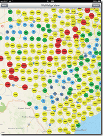
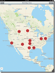 Much like the web application, the iOS app drops you right into the map view. Here you’ll notice the familiar iOS maps interface with our well clusters. In the map view you can use all the normal
  gestures you have come to know with Apple devices. You can also touch any cluster or well spot to see the information about whatever it is that you have touched. Touching the blue arrow will zoom you into the cluster you have touched or take you to the well detail in the case of touching a well spot. You can easily dig through the data by simply zooming into a location and viewing the well spots, but filtering will allow you to get a more direct look at exactly what you are searching for.
To open the filters touch the Search button on the top right of the title bar. This will 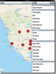 slide out
 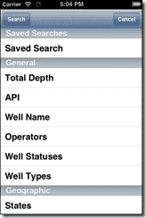 the filter list. On the iPad the filter list only takes up a portion of the screen, allowing you to maintain view of what you currently have up on the map. The iPhone version on the other hand takes up the width of the screen due to the smaller size. All WellDatabase screens will take advantage of the new iPhone 5’s larger, 4 inch screen.
The filter panel contains most of the same filters from the web application, grouped in the same fashion. Now before we move on to the filters, we are going to take a second to look a the features of the filter panel.
At the very top of the filter panel, you will see Search and Cancel buttons. The Search button will execute the search based on the current filters and hide the filter panel. The Cancel button will simply hide the filter panel. All of the filters you may have setup will still be there and can be accessed by touching the Search button again, but the filters will not have been applied to the map.
Directly below that is the Saved Searches section. This unique feature allows you to save filters once you have them set. One of the best things about this feature is that your saved searches are automatically synced between the iOS application and the web portal. To that point, all of your settings and saved items are immediately sync’d between the applications.
If you touch Saved Search the row will expand and you will have a text box that says “Touch to pick search” as well as a small document icon with an arrow. Touching the text box will pop up a selector to pick from any existing saved searches you may have. The image on the left is the iPad pop-over and the right is the iPhone.
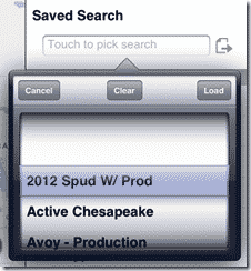
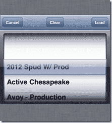
You can now select any of the saved searches and touch the Load button to load the filters from that particular saved search. Touching the Cancel button will cancel out the dialog and bring you back to the filter panel. If you already have a saved search selected, you can touch the Clear button to clear out any currently loaded filters.
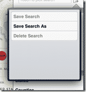 If you touch the document icon with the arrow, you will be given the option to save your current filters for later use. If you are creating a new filter, the only option is to Save Search As. This will give you a prompt to name the search and then save it to your saved search list. If you happen to have an existing filter set selected, you will be given the option overwrite your search by touching Save Search. From here you will also be able to delete the selected search by touching the Delete Search option.
If you read the previous blog, you might already be aware of the types of searches available in WellDatabase. Those same search types exist in the iOS application and we will go over the basics of the types of searches before looking at the actual filters available in the iOS application.
One special item in regard to the filters available in the iOS application. When you initially look at the filter panel, there are no text boxes, date selectors, or anything other than the list of filters. In order to use the filter, you simply touch the filter you wish to use and you will be presented with the appropriate interface for that filter.
The first type is the general text field. These fields allow for any input and perform a  wildcard search. Just like the web application, these searches test the field to see if the value you typed exists anywhere in the value. For example, typing 42135 in the API search, you will get wells that start with 42135 (Andrews Co., TX) as well as the WAGGONER, J & J -C- 19 well in Wichita Co, TX since its API is 4248542135.
The second type of filter is the range filter. Range filters can be either numerical ranges or date ranges. To use a numerical range you’ll need to type the value you want in each box and then touch the Save button. This will set the filter but the search will not execute until you touch the Search button at the top.
![]()
![]()
Of course to edit this filter, you simply touch the filter row and the textboxes reappear.To remove the filter you will need to delete both of the values and touch the Save button.
Date filter work essentially the same way except when you touch the textbox, you are presented 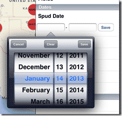 with a date selector. Again the iPad version allows for popups on the filter panel while the
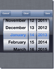 iPhone version requires the screen to swap to the date selector. To pick a date from the date selector, you can scroll to the desired date and touch the Save button. Touching the Cancel button will hide the picker and take you back to the filter panel. In order to remove any date values already set you will need to touch the Clear button in the date picker. This will remove the date from the field and it will not affect search results.
All range filters will allow you to specify one or both values in the range. If you want to see all wells spudded since 1/1/2012, you just need to put that date in the left box and leave the right empty. If you wanted wells spudded before 1/1/2012, you would put that date in the right box. It’s essentially just a “from” and “to” box..
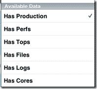 The third type is a simple data check. If you touch any of these rows, a checkmark will appear in the row indicating that the filter is in place. To remove the check, touch the field again. An example is Has Production where the search will return only wells that have production data within WellDatabase.
The last and most unique type of filter in the iOS application is the multi-select. The multi select allows you to select multiple values to search for a particular filter. This comes in handy when selecting counties, states, well types, operators, and many more. This is also the filter that differs most between the iPad and iPhone versions of the app, so we’ll go over each one individually here.
To get started, just touch the filter you are interested in. For this example, we will use the Operator. Once you touch the Operators item, the Select Operators dialog appears. 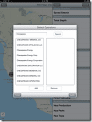 Here you have a textbox at the top for searching, a list on the left for available choices and a list on the right for selected choices. To start searching, type in the first few characters of the operator you are looking for. In this example, we will go ahead and type out Chesapeake. Once we do that and touch Search, we get a list of matches on the left side. You can easily scroll this list and find the operator name or names you are looking for. Operators can be especially tricky since the state agencies tend to have several variations of a particular operator. WellDatabase does not attempt to alter this data in any way.
Once you find 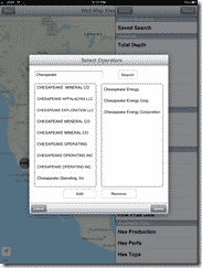 the operator name you would like to filter on, touch it and then touch the Add button. This will move the operator into the list on the right side. You can move as many values to the right list as you would like and it will find all wells that exist for any of the values selected. You can also change the value in the textbox and search for additional options to add to the filter. Once you have all the options you are interested
 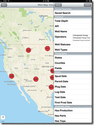 in, you can just touch the Update button and the multi-select dialog will go away and you will be back at the filter panel. The filter you used will now list all of the selected options in the filter panel so you can easily see your current criteria. If you would like to remove options, you can touch the filter again to bring up the multi-select dialog. There you can see the current values again in the right list. Touch the one you want to remove and then touch the Remove button. It will move it back over to the available list where you can quickly re-add the value if you have removed it by accident.
The iPhone version of the multi-select is very similar, but a little different due to the screen size. When you touch the filter, it will open directly to a search screen with a textbox at the top. At the bottom you will notice the tabs for Selected and Search. If you wish to immediately cancel out of this search, you will need to touch the Selected tab first and then touch the Cancel button. Since we are going to use this filter, we will continue on. Just like in the iPad, we will type in Chesapeake and touch Search on the keyboard. This will bring back the list of available options. In the iPhone version, you simply touch the values you want to use and they will disappear from the available list and will be moved to the selected list. This is easily viewable by touching the Selected tab. You can freely switch between the tabs and add as many values as you need. If you want to remove an item from the selected list you can swipe on the value you want to remove and a Delete button will appear. Touching the Delete button will immediately remove the option from the selected list.
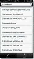
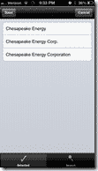

When you are finished, touch the Save button on the Selected tab and you will be brought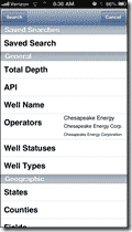 back to the filter panel with the items listed for the filter. If you want to remove items from the filter then you can touch the filter again to show the multi-select dialog, go to the Selected tab, and swipe on any values you wish to remove.
The iPhone version does require a few more steps but still provides a simple, easy to use interface for searching through millions of records on a handheld device.
Now that we have covered the basics on searching on the iOS application, we can go over the actual filters available. Our web application is where a lot of our main research and development happens, so some filters will be available on the web application and not on the mobile app. These filters will be caught up in the next release and will match the web application filters. Just a warning, these descriptions will be the same as the ones listed in the previous blog.
The General section contains the most common data about a well. Nearly every well in our database contains these items and can be searched.
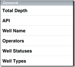 Total Depth – This value is typically the Drill Depth, but in some areas the Log Depth is all that is available. In that case, the Total Depth is equal to the Log Depth as it is the only depth marker available for the well.
API – The well API number. API ranges between 10 and 14 digits with no dashes. All searches are wildcard searches.
Well Name – The name of the well. Many times this is comprised of a well or lease name and well number, but even that can vary from state to state. As with API, all searches are wildcard searches.
Current Operators – The operator currently listed by the state agencies.
Well Statuses – The status given to a well by the state agencies. These statuses can be tricky due to the fact that states vary widely on how they define the status of a well. If you are unsure which status applies to the area you are looking at, try to look at some of the well details in the state or states you are interested in. This filter is a multi-select, so you can choose as many options as you would like to make sure your search is complete.
Well Types – Well types are the only field that we normalize so that it is more standard across our entire dataset. The well detail will show the original type from the state, but the search allows you to filter by a more generic list of well types (Oil, Gas, Injection, etc.)
 The geographic section pulls together all searchable items that have to do with location. These filters work extremely well with the map interface and allow you to search in ways never before possible.
States and Counties – Simply the state and county that the state agency has marked the well as being in. Just a warning, this doesn’t always match the API number as it should, but again, it is what the state agency reported with their data.
Fields – The field marked for a particular well. Most states just establish a simple field name for reference, but others may have more to it. For example, Texas will typically add the producing horizon on the field name.
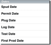 The Dates section is very helpful for determining activity within a particular date range. Once again, states vary widely on the dates they provide. The most commonly provided date is the Spud Date, but the other choices are provided by several states as well. With the date filters you have to remember that if the well doesn’t have that particular date, it will not show up in the search regardless of the range specified.
Each of the dates available are pretty simple dates that nearly all wells have the ability to have. The key is simply if the state reports those dates or not.
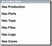 This section is one of the easiest and most useful filters we provide in WellDatabase. With a single click, you can filter to wells that have logs, have production, or even core data. As you can imagine, this kind of quick filtering will allow you to easily weed out wells that do not have the data you find helpful.
WellDatabase is the first mobile app to offer the ability to search for oil & gas wells across the entire country. There is honestly nothing even close to it in the App Store. Just as with the site, there were a lot of challenges to make this happen. While there are some nuances to our searching, overall it is a simple and intuitive interface designed specifically for mobile devices.
Be on the lookout for our future updates to the iOS app and a new Android app coming soon. We plan to continue pushing the limits of what you can do on a mobile device with our data and providing an unbeatable product.
If you’re not already a WellDatabase user, sign up here and start creating your filters.
As always, feel free to contact us at support@welldatabase.com with any questions or comments.
1 min read
In our previous posts we covered searching in both the web application and the mobile application. Today we are continuing with our series on using ...
1 min read
Today we are happy to announce that our iPhone application is live and in the app store. The iPad application has been downloaded hundreds of times...
1 min read
With the launch of our iPad application, we wanted to put together a quick rundown on the application and what it can do. Considering the simplicity...