 John Ferrell
1 min read
Using DCA to Compare Operators
Out of the 2,435,234 ways to use decline curve analysis, one is to compare operators. Comparing the average type curves for each operator based on...


The industry didn't start with unconventionals and neither does our data. We cover the full historical dataset across every producing state and province. Don't settle for inferior data, check out our coverage for any state or province you're interested in.


One of the most common uses of WellDatabase is to understand and compare nearby operators. This is commonly referred to as "looking over the fence". Today we'll run through five tips you can use to more effectively analyze what offset operators are doing.
It is important to note that the primary goal is to understand what is happening over the fence. Once you understand the dynamics of what offset operators are doing, then you can decide how it applies to your operations and goals.
When looking over the fence, it's easy to compare apples and oranges accidentally. Some properties to check are obvious, like lateral length, proppant pumped, and depth/formation. Some less obvious things to look for are choke numbers, lifting method, perforation length, and other well construction details. Every time you want to look over the fence, you should have a specific goal and ensure you are picking wells accordingly.
At a deeper level, understanding an operator's overall strategy and financial situation gives additional color to the decisions being made. All of this is pretty complicated, but it allows you to paint a more complete picture of what is happening over the fence. If you don't have good offsets to compare results, then you will have trouble making sense of what is going on.
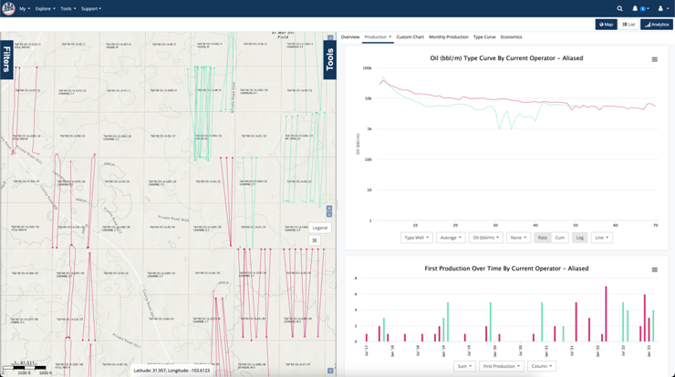
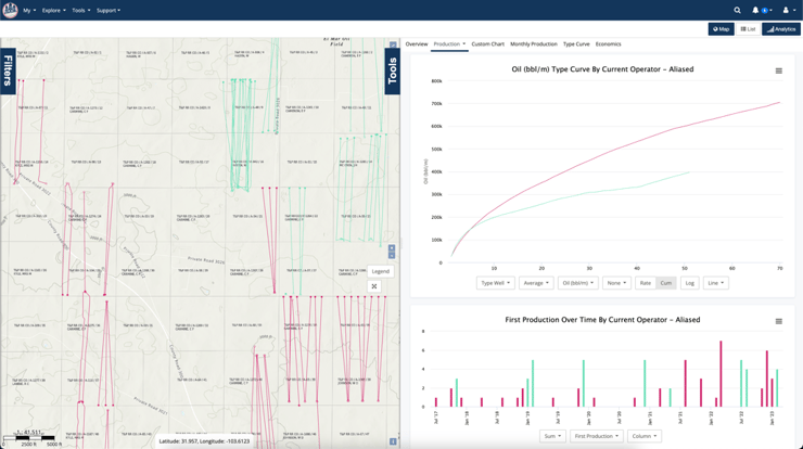
As an example of how easy it is to pick wells that look similar, here is a group of wells from one operator in the Bakken. The type curves look like an exact match. These wells were developed in two groups just a year apart.
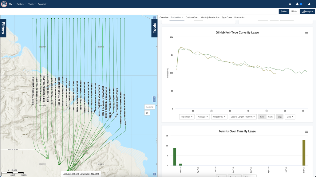
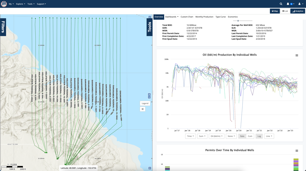
Even if we look at individual well production, the wells look like they're basically the same.
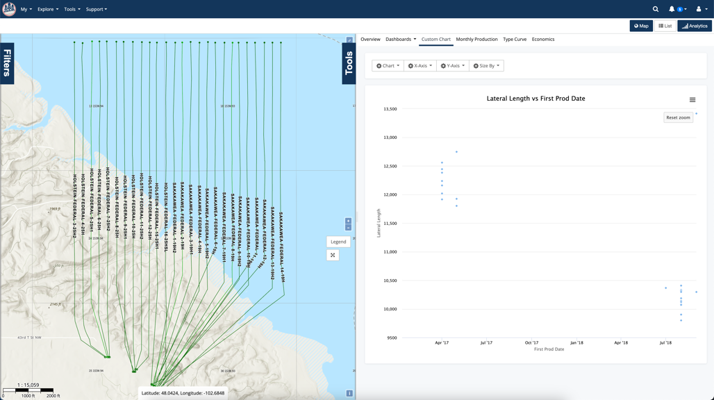
But looks are deceiving. The batch of wells drilled in 2018 are over 2,000 feet shorter than the ones drilled in 2017. Now that we see it in the chart, it does become more apparent on the map that the wells to the east take a different trajectory.
I should point out that these wells could be good offsets for some cases, but definitely not for others. Regardless, you must be vigilant when picking your offsets to ensure they fit your needs.
This is an easy trap to fall into. So many times we're diving into data just looking at who the current operators are. This is great for an understanding of the operators current position. However, when comparing things like completion techniques, you need to be looking at the original/completion operator. Wells change hands every day and at every step of the well life. Different criteria may drive an operator's decisions while designing a completion than an operator who has purchased existing production. It is easy to miss, but always ensure you are comparing the correct operator.
Here's a look at Marathon's current assets in the Eagle Ford.
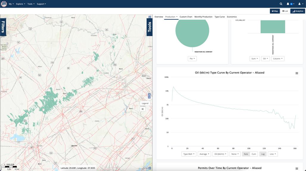
While Marathon did drill many of these wells, their assets are a mix of what they drilled and acquired from more than ten companies.
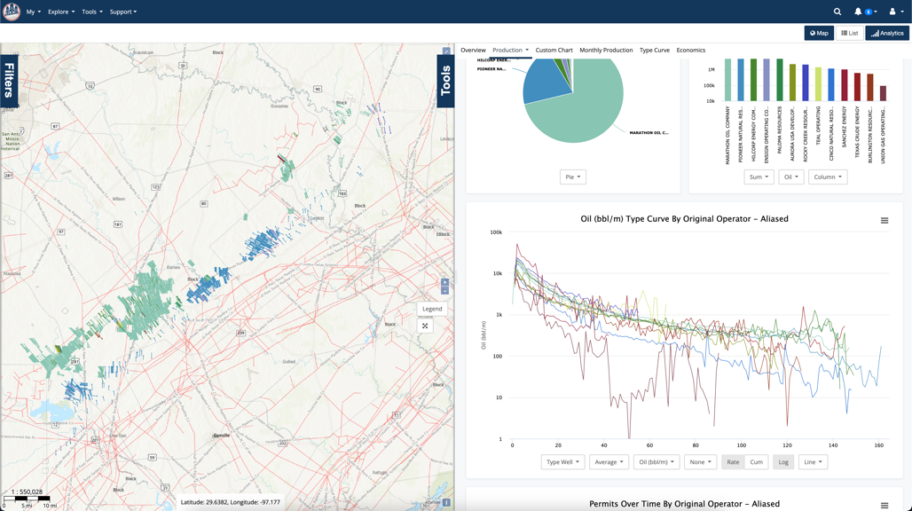
You can see from the image above that the production profile from the different original operators varies pretty significantly. Mixing this up could easily lead to misconceptions about Marathon's operations in the Eagle Ford.
Many times people will start an analysis with a new well nearby and attempt to understand what is going on. While this is possible in some cases, your best bet is to understand that new well within the context of the overall trends in the play. You can do this by zooming out and looking at larger scale trends. Are laterals getting longer? What is the trend in proppant loading? Are B values trending upwards or downwards? What you see in the new well might be a continuation of an overall trend. Once you identify those trends, you can better understand how this new well fits and how the results are affected.
Here we're looking at the Bakken as a whole. This is a good set of wells where we have data over some time. The first image is the average proppant per well over time, colored by the operator.
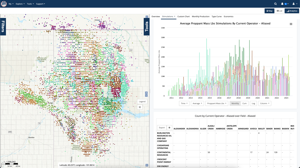
You can see the overall trends here pretty clearly. The proppant numbers increased slowly until ~2017, and then you see a jump. Around 2020, it goes back down and hangs out there through the most recent completions.
Now let's take just the top operators (by well count) in the Bakken and look at their production profiles over time (vintage).
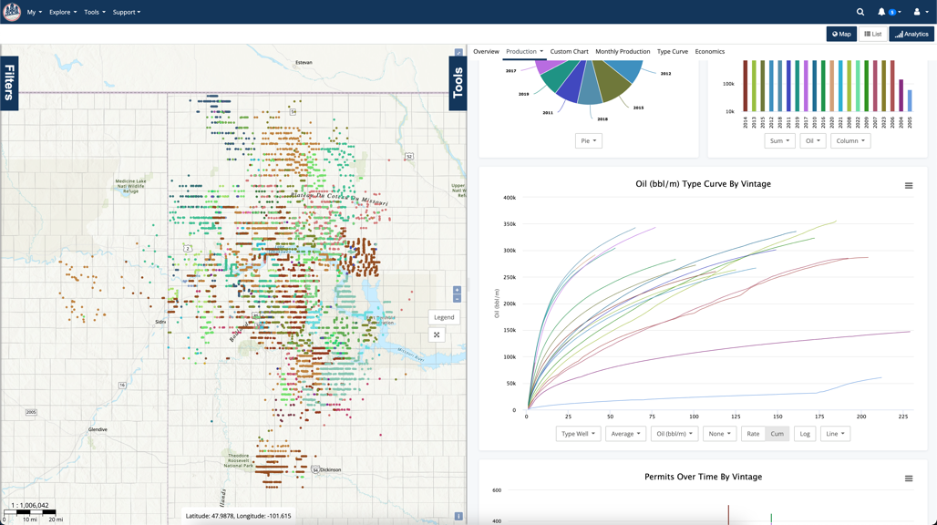
The cluster of production that is standing out is from wells drilled since 2017, when we saw that jump in proppant usage. Interestingly, more recent years appear to be on the same trajectory, but utilizing less proppant. This overall trend is worth investigating, but it would have been more challenging to discover if we had not backed out and looked at the wells at a high level.
You might not think that the statement above is true, but it is. You might be able to account for enough variables using two adjacent wells from the same operator (and vintage) to determine which well was better...maybe. Comparing wells between two different operators adds layers that are all but impossible to account for. Specifically financial related items like availability of capital, LOE costs, and more. Remember, a "better well" is really a well that has a better return on the investment. Not necessarily one that just produced more.
Below is a set of wells that have been normalized for lateral length, depth, formation, proppant, vintage, and are all within around 20 miles of each other. The initial view of well level production in the cumulative plot looks like these wells are close-ish.
When you roll them up by the operator, it becomes clear that these wells were operated very differently. Still, you might think that they're pretty close, but...
Just flipping the chart to a cumulative chart shows just how drastically different the production profiles of these wells are.
The fact of the matter here is that the operators had different strategies. We could dive deep into this now if we wanted to understand better, but these two operators were both pleased with their wells and it's because they had different goals. Different time horizons for measuring their returns. Maybe a press release on a high IP that bumps the stock price. Regardless, there is more at play here than just a "better well".
Hindsight is always 20/20, and identifying trends in completions is pretty easy to do looking back. Many times at a large scale, you'll be able to see the trend. While that is helpful for an overall understanding of a play, it's not particularly useful for staying ahead of the competition. Being able to identify trends early is key. The way to do this is to look for outliers in the most recent data. Remember that there is a natural lag in reporting that means the completions data is typically weeks old at best and production is months. Still, the outliers are the ones to pay attention to because they typically represent an operator who is trying something new. When you identify an outlier in, then it's time to expand your search to see if you spot that trend in other basins. Sometimes you'll need to monitor those wells to understand results over time, but the first step is to identify those wells.
This is another image that we looked at earlier. It is average proppant use in the Bakken over time.
Look at the outliers back in 2015. This operator was experimenting with proppant and others would follow over the next couple of years. Additionally, you can spot the drop in proppant usage in late 2019. That lower proppant usage continues today.
Looking over the fence is very common and a useful technique in understanding the dynamics of a play. While there are some pitfalls, you can overcome them all by ensuring that you have a clear goal and keeping the tips in the article in mind.
It is summer though, and you're sure to be cooking something of your own in the backyard. Just like you might not be able to have the sexiest well in the play, you can't always be cooking steaks and briskets. As a bonus, here is a link to how to make outstanding barbecue chicken breast. Might not be as cool as a NY Strip or Filet Mignon, but everyone needs some variety. I promise everyone will love it.
1 min read
Out of the 2,435,234 ways to use decline curve analysis, one is to compare operators. Comparing the average type curves for each operator based on...
1 min read
Let me introduce you to one of our most powerful yet user-friendly features: map color customization. Whether you're analyzing well locations,...
1 min read
We get asked all the time about the method we use to allocate Texas production data. For those who might not know, Texas requires operators to report...