While writing up the post on comparing operators using DCA, we ran across a set of wells where the best fit didn’t exactly fit as well as we would have liked. Turns out, real world production doesn’t always fit into the box you want it to. That’s ok though, we can work around it. For this post, we’ll dive into exactly how to define a good fit, what to do when the best fit doesn’t fit, and how to come to a solid answer with atypical data.
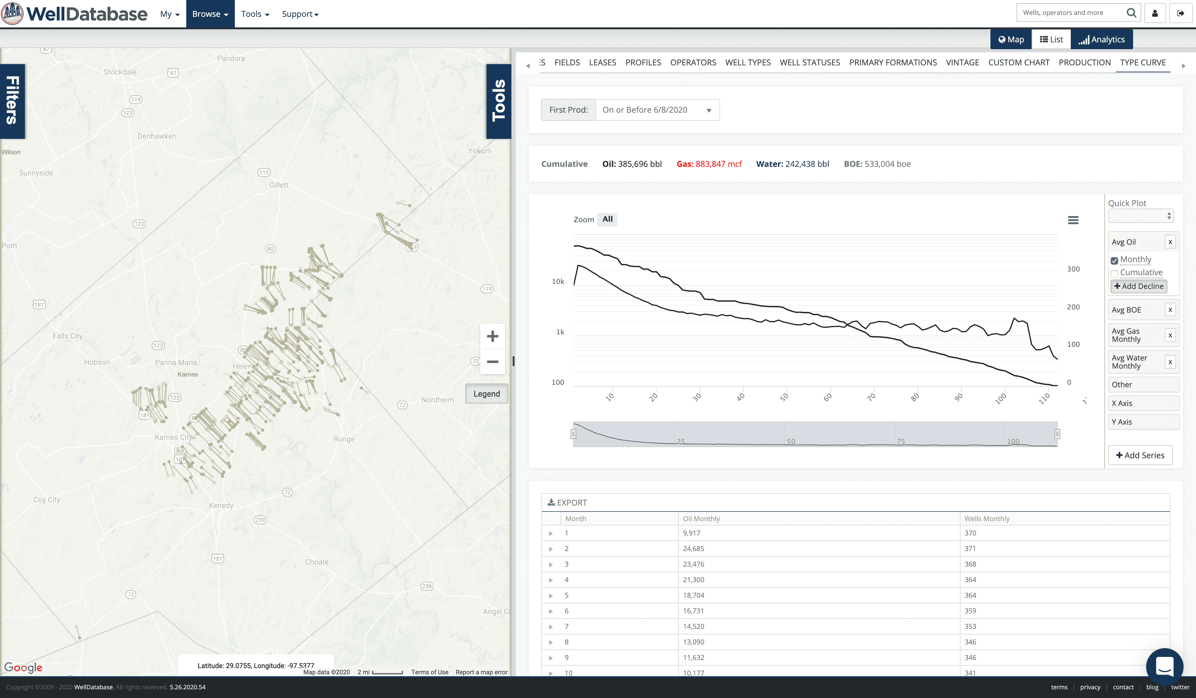
The target wells are in Karnes county and operated by Burlington Resources (acquired by ConocoPhillips in 2005. They continue to operate as Burlington Resources in Texas and other areas.
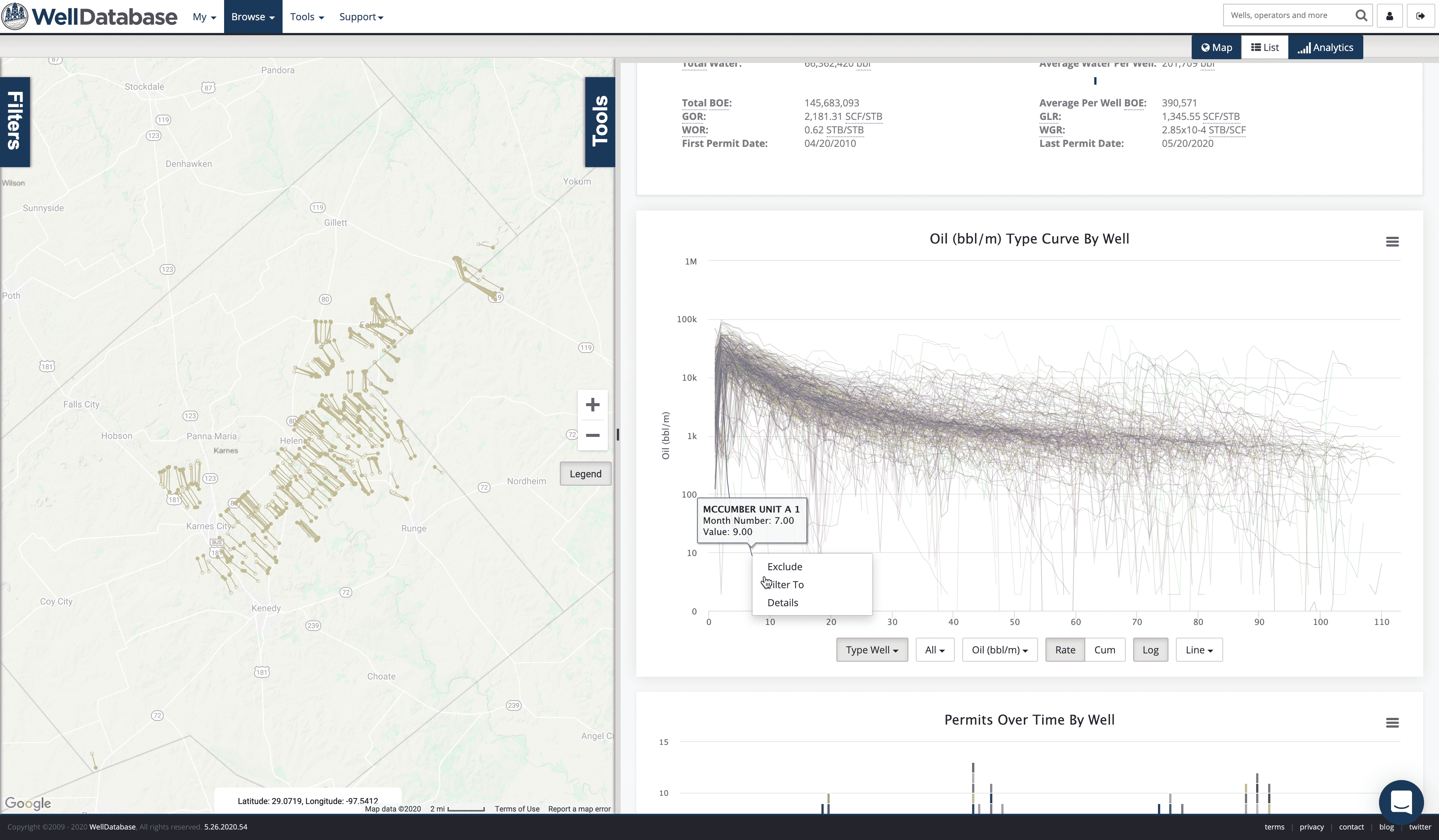
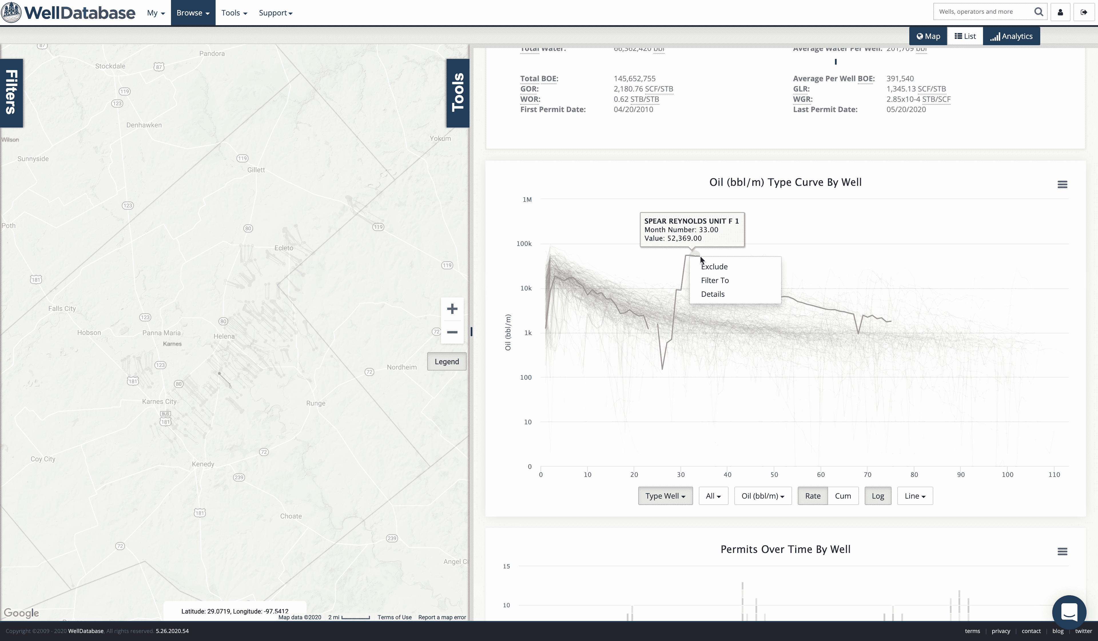
Here is what their position looks like and a production curve (by month number) for each of the wells.
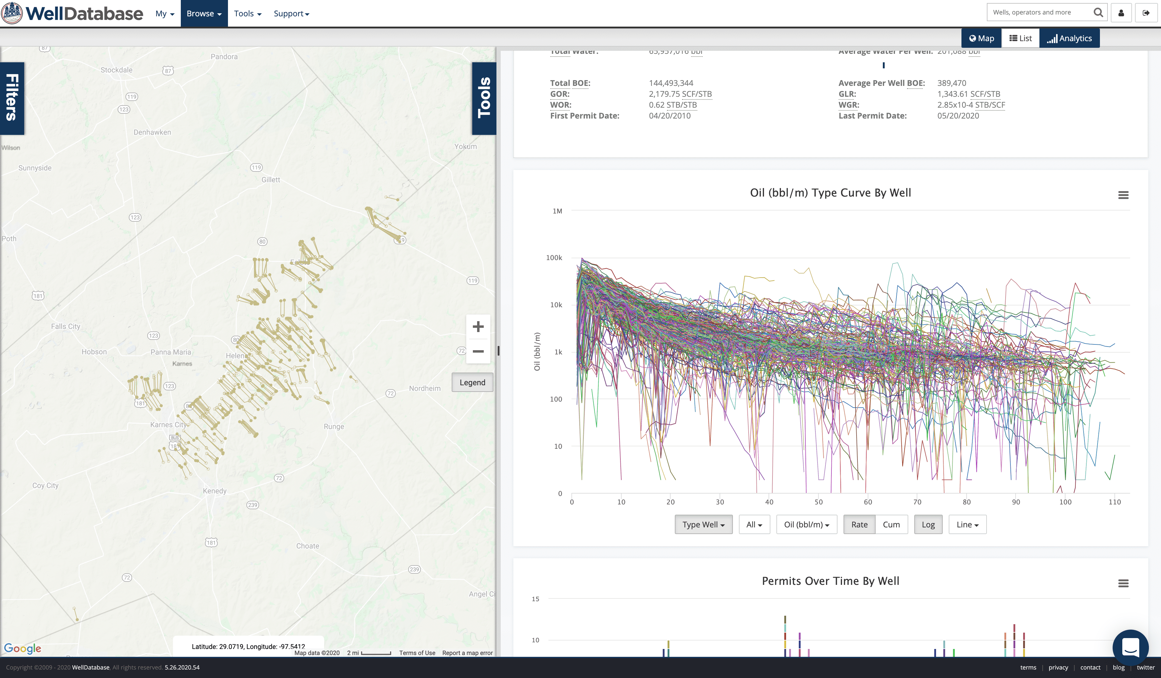
We can see a few outliers there, but nothing that is insanely bad. Cleaning outliers is a sticky situation. You have a couple options in WellDatabase.
You can axe them one at a time. Click on any well’s production and click the Exclude option.
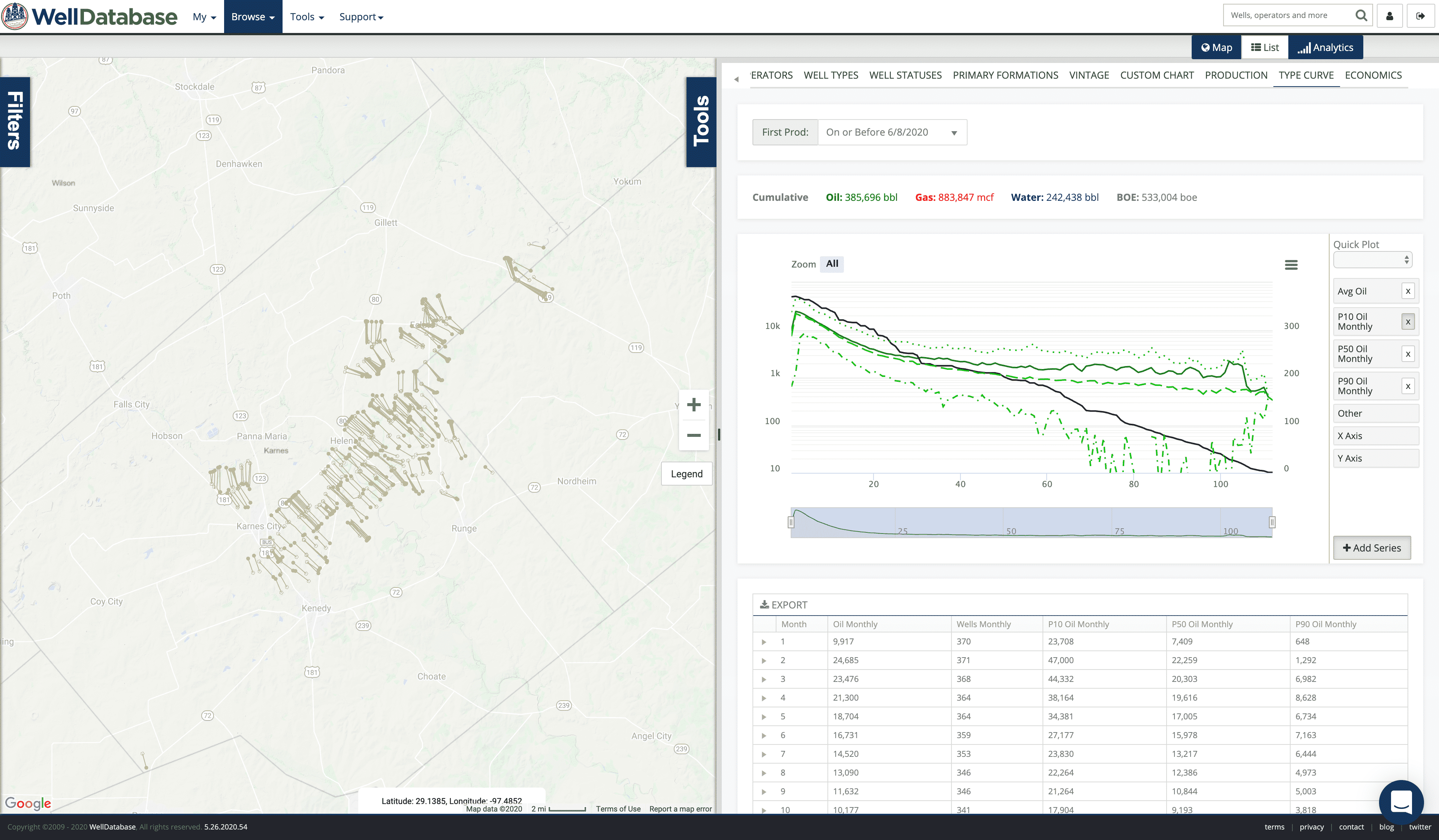
Or we can choose to use percentile curves to clean up the outliers. P50 will give us the middle 50% for each reporting period. P10 and P90 are options as well. Here are each of them along with the average.
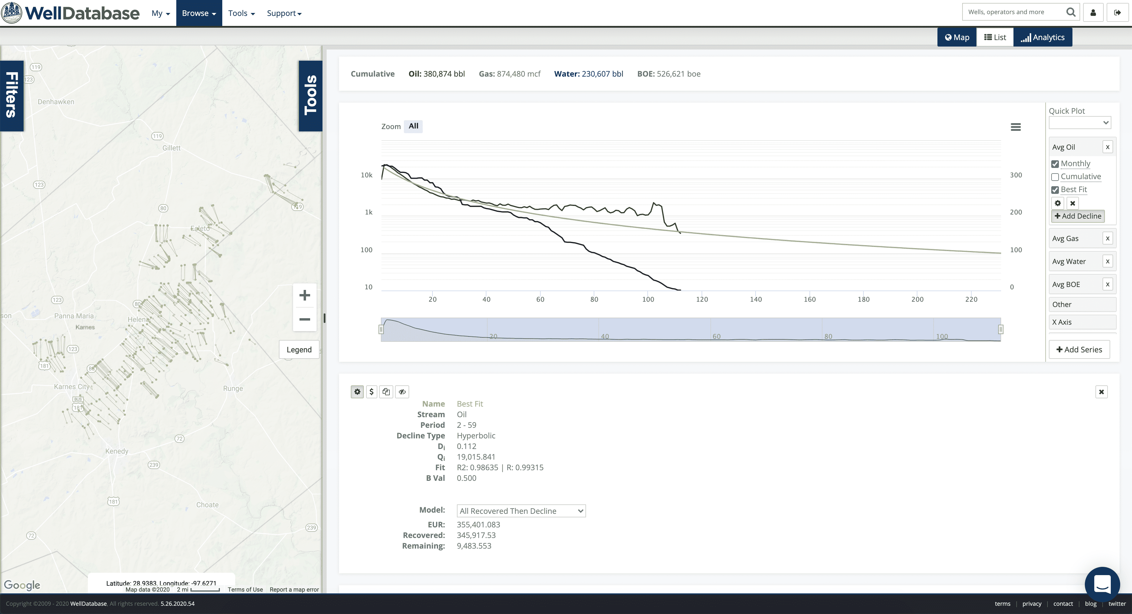
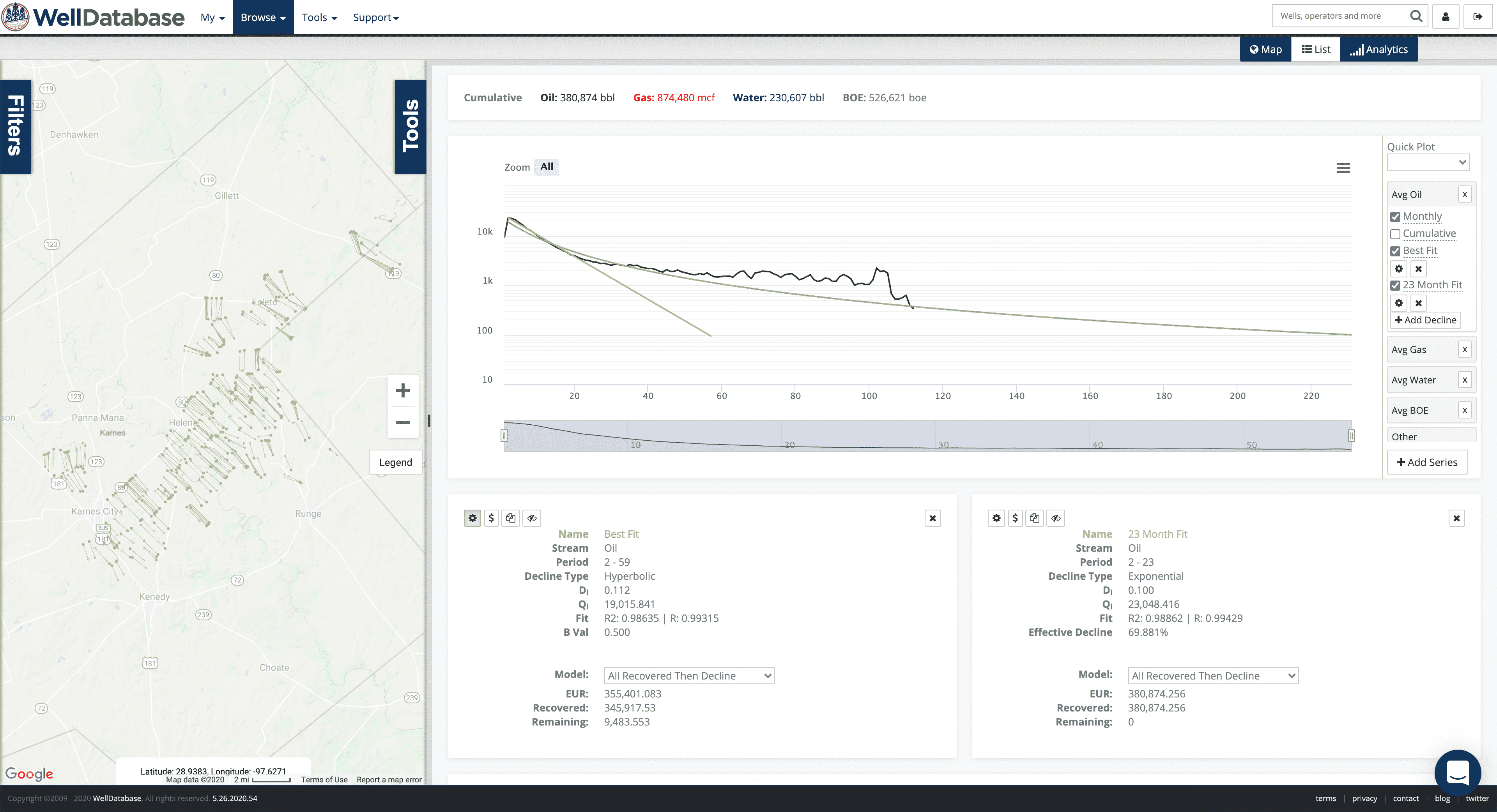
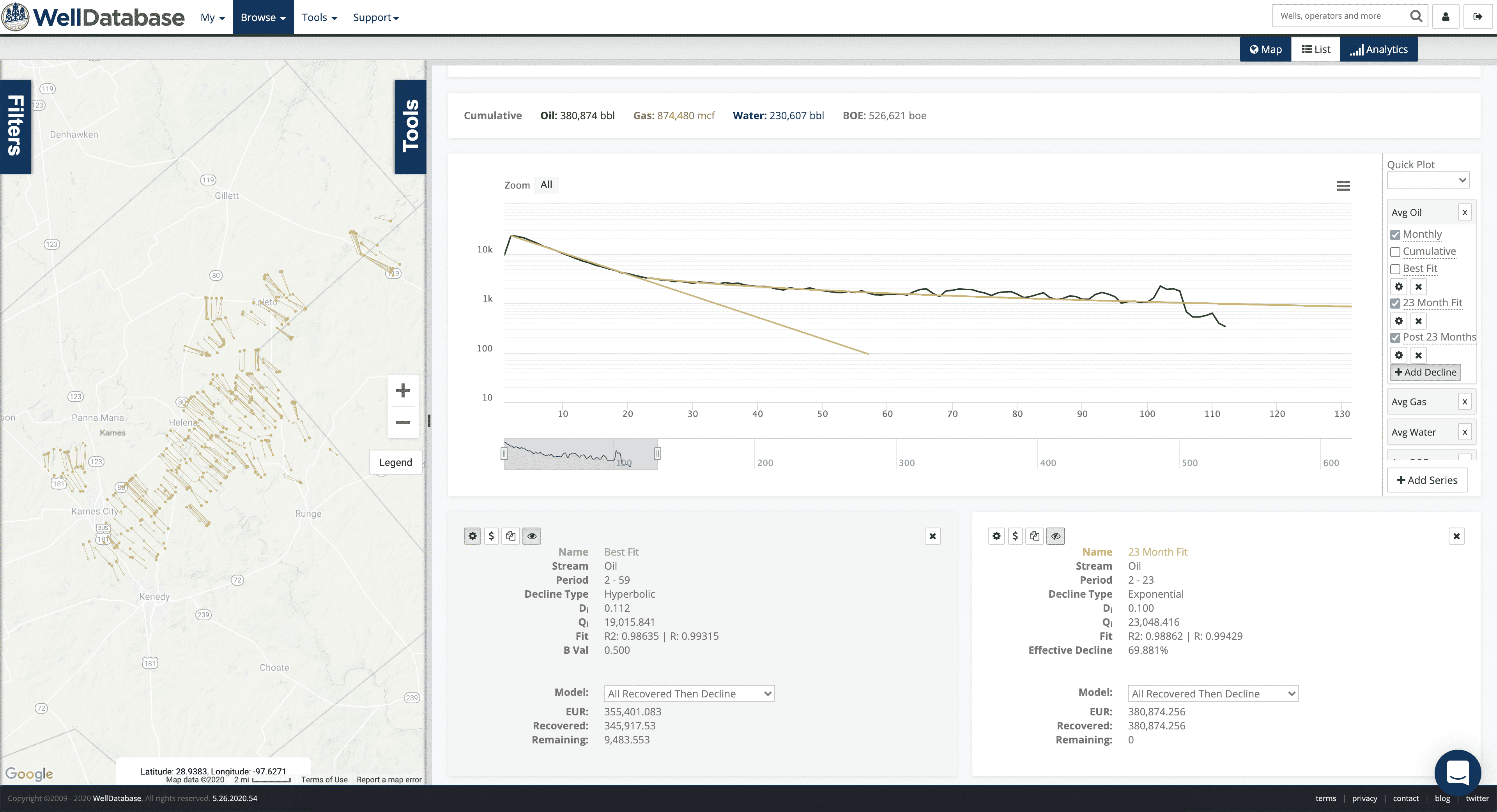
The bad news is that the average and P50 have the same issue, the fit sucks. For this example, we’ll just stick with the average. Here’s what that looks like.
Even a quick visual inspection shows that the early months declined at a different rate than the later months. To get an idea of how much variance there really is, we can throw a best fit decline on there.
It’s ok-ish zoomed out. If you zoom in though, it’s clear the fit isn’t so great.
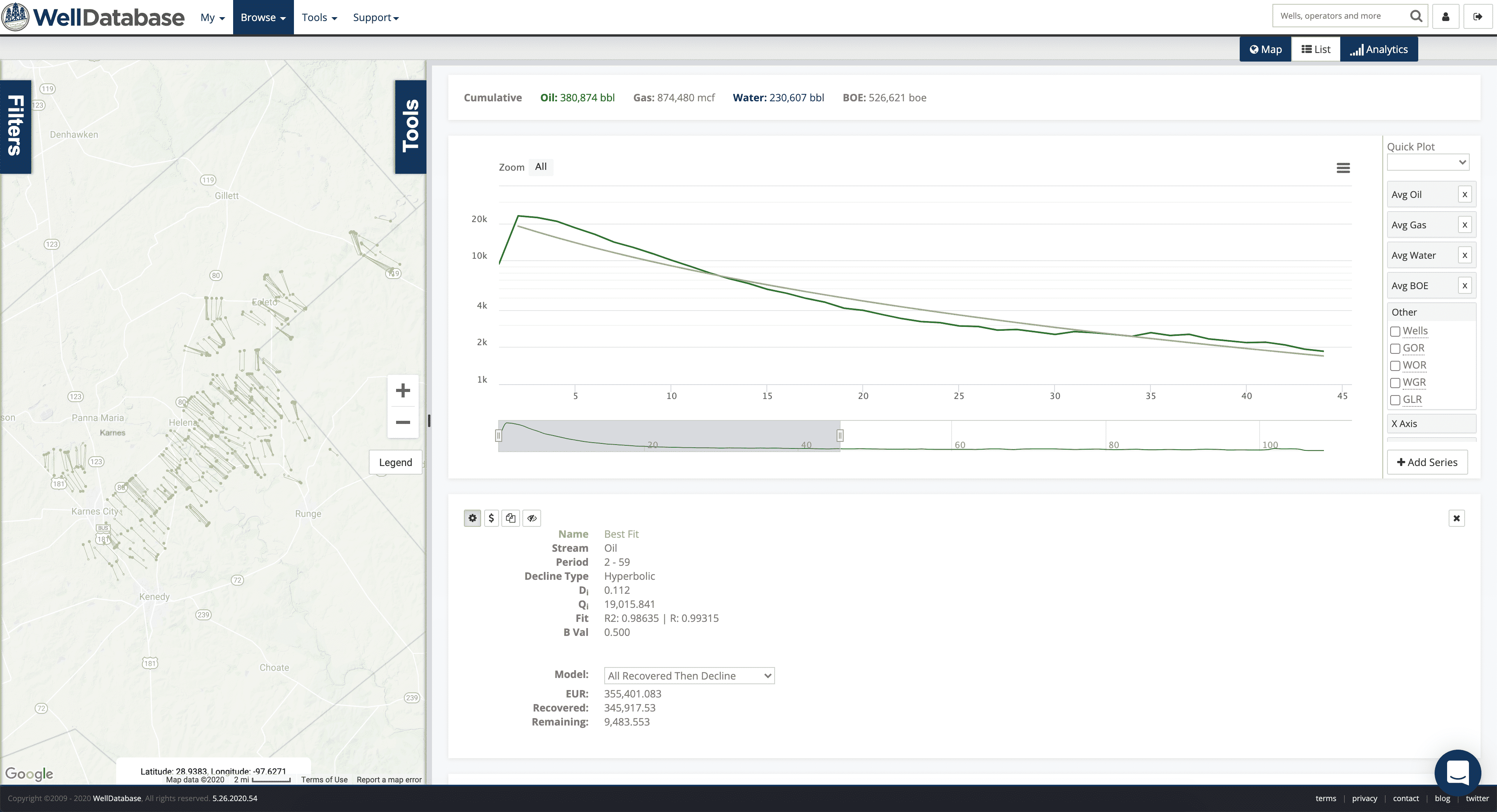
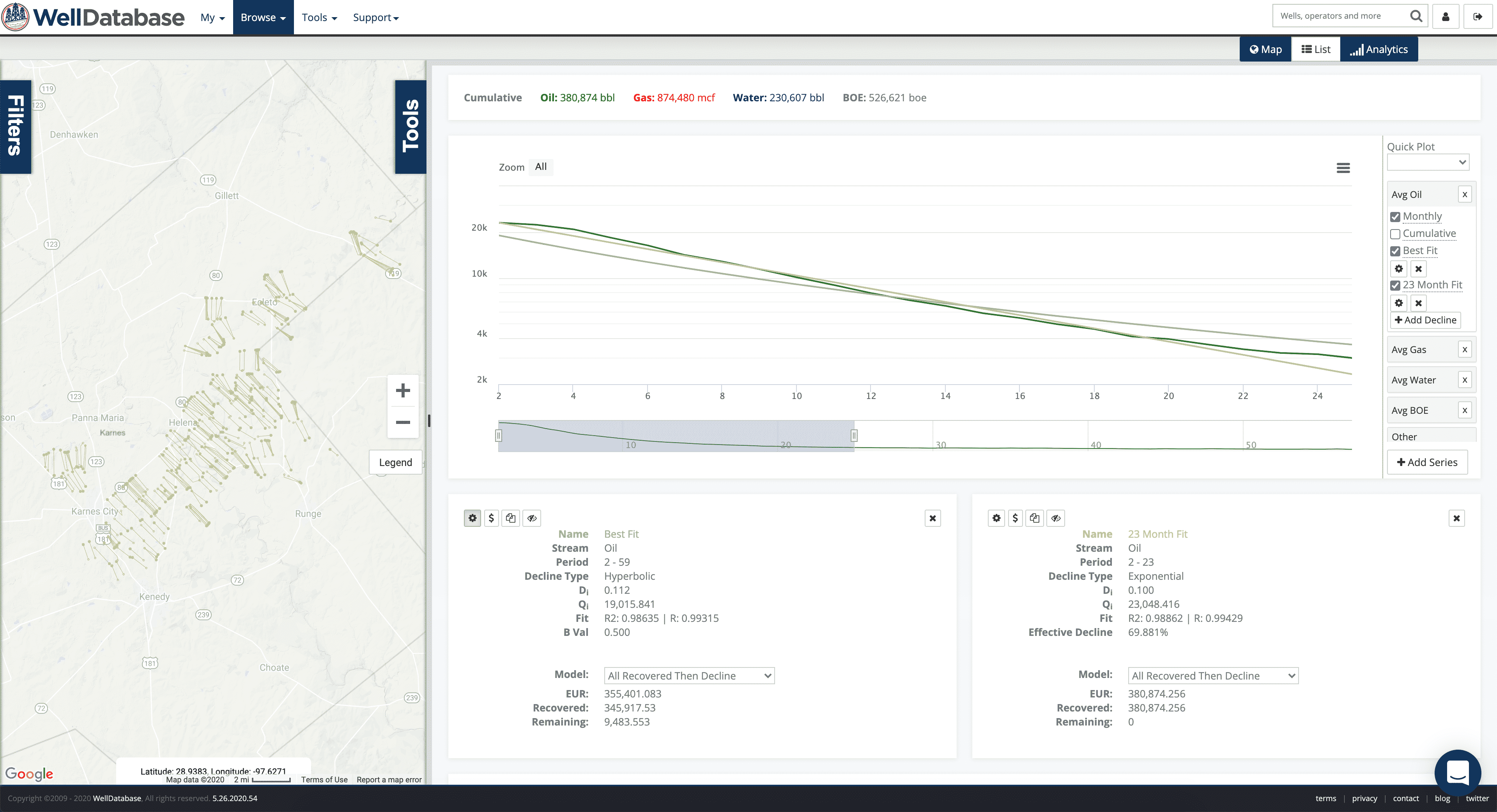
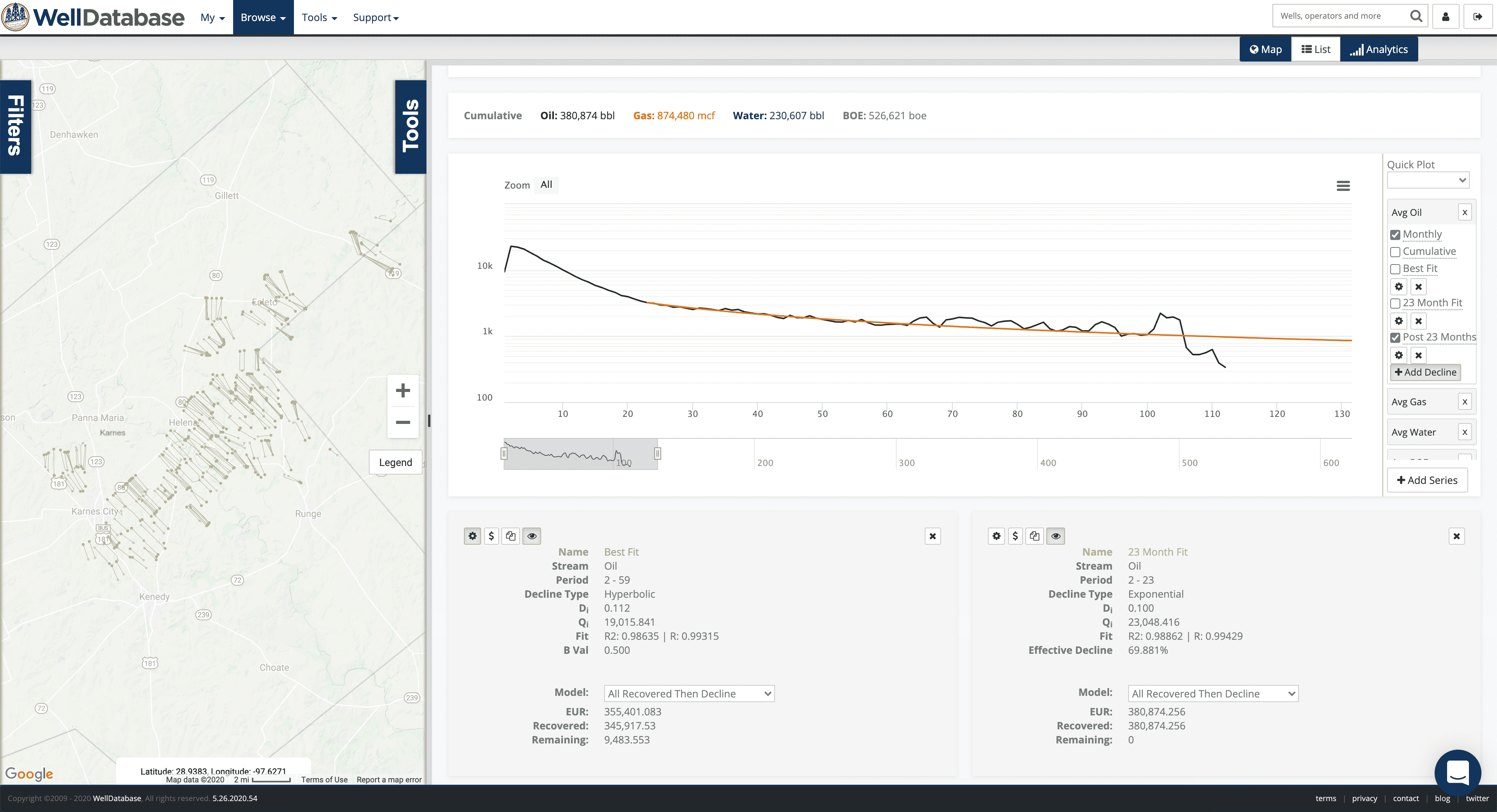
Keep in mind you always have the nifty r2 value to help you gauge the fit. Now we’ll zoom into the early months to where the fit is at it’s worst.
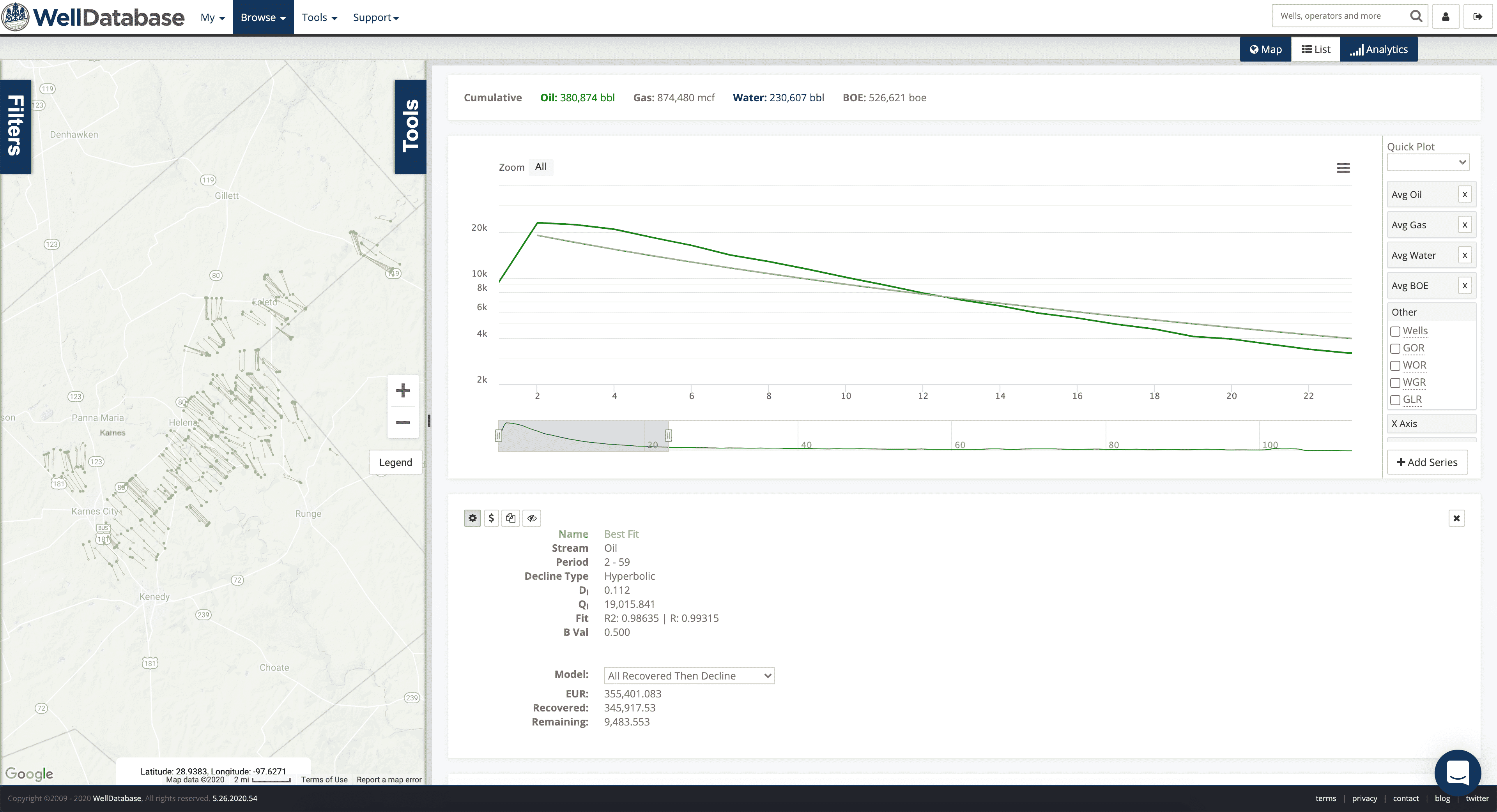
While zoomed in here, we can try a new fit to see what the result is just using this period.
The result is an exponential decline that fits pretty well. If we zoom into the fit period, we can see that pretty clearly.
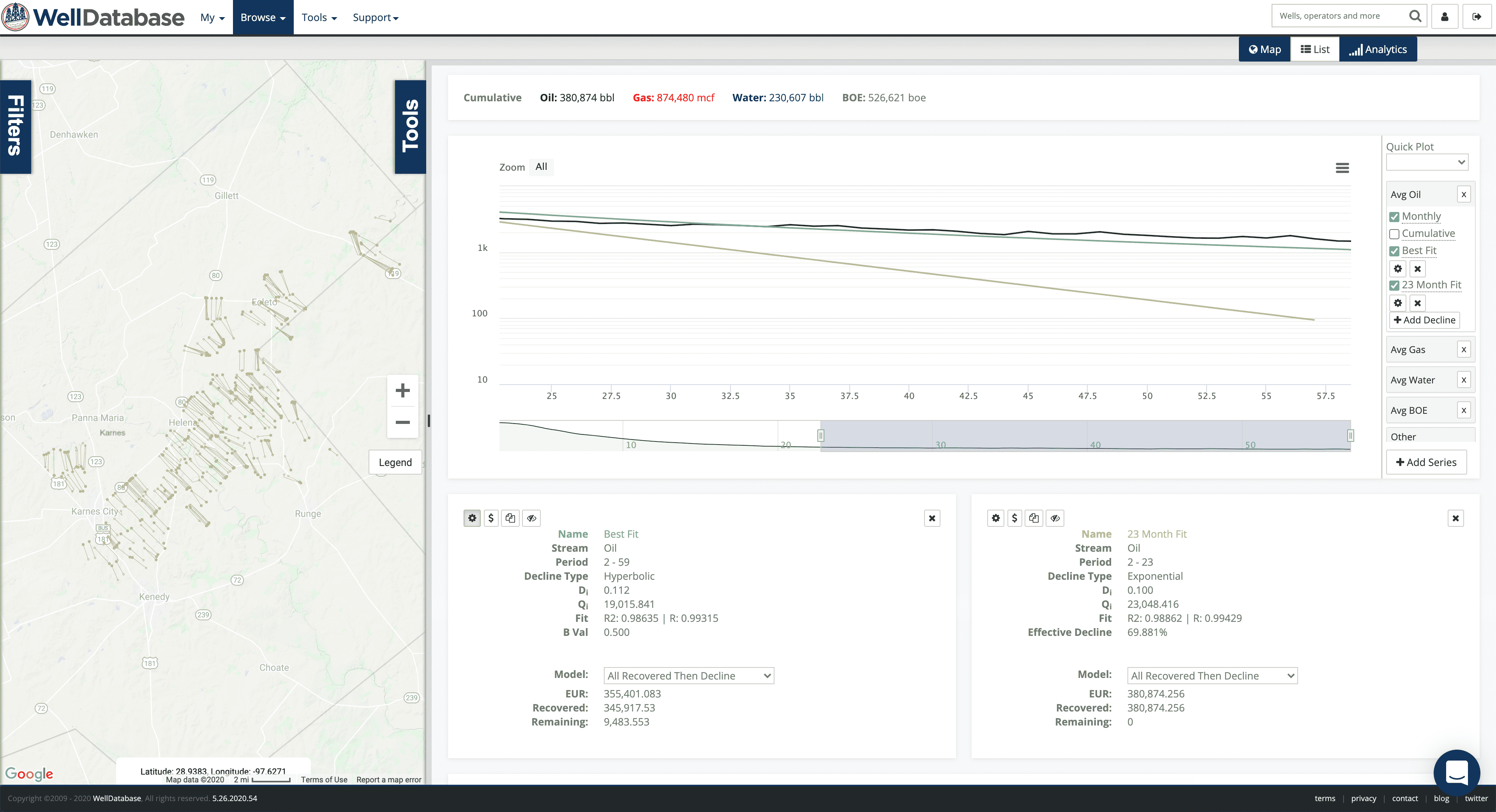
Looks good. Especially compared the the previous best fit. But….
When we zoom out, it is clear that the fit is only good for those 23 months. Then it quickly falls off. So now we’ll zoom into months 23-59 and fit a new curve to that period.
That fits nicely over that period and beyond. Now let’s look at both together.
Looks pretty clear that there are two distinct decline sections. 23 month of exponential decline followed by a pretty flat hyperbolic decline.
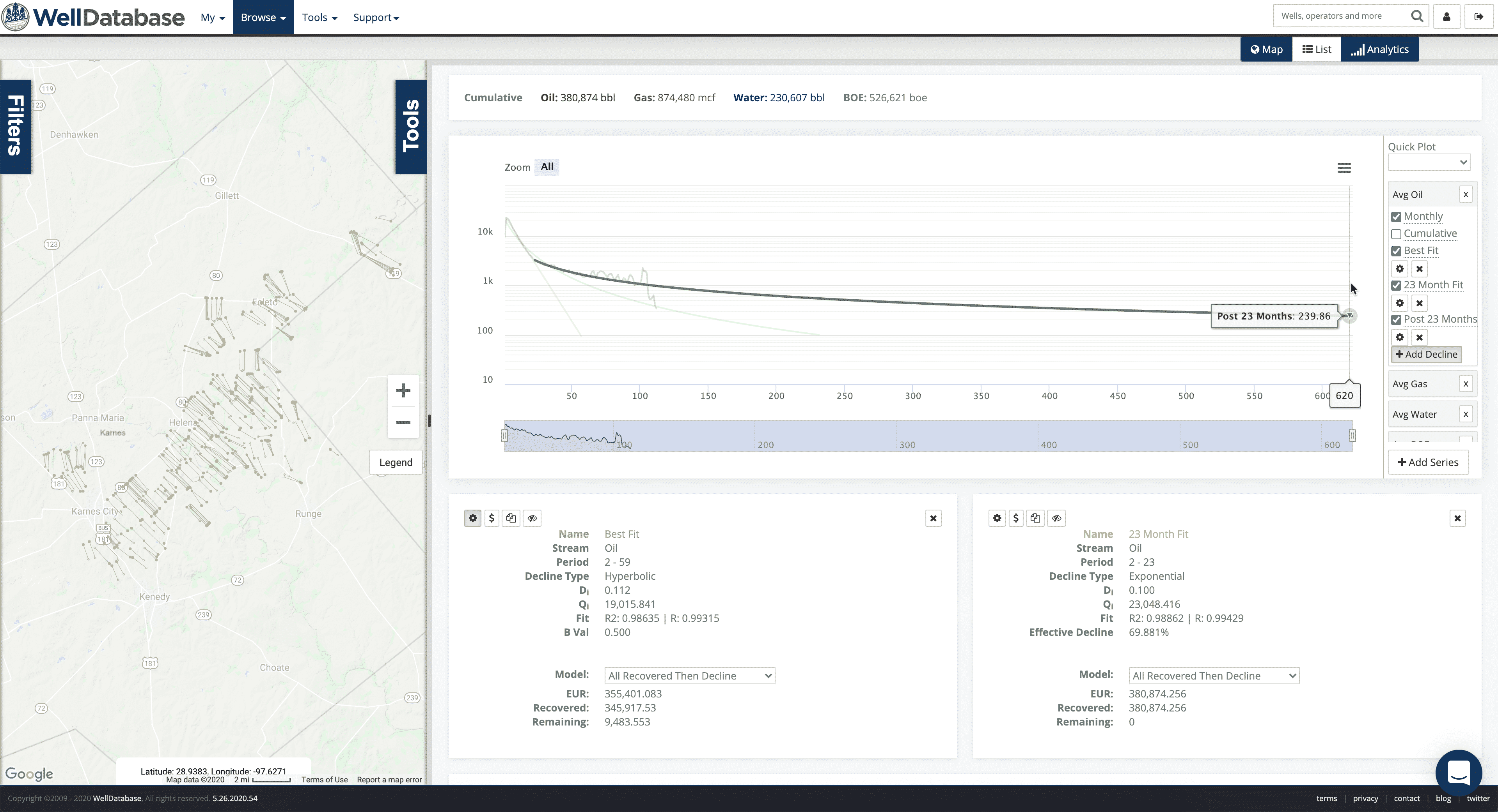
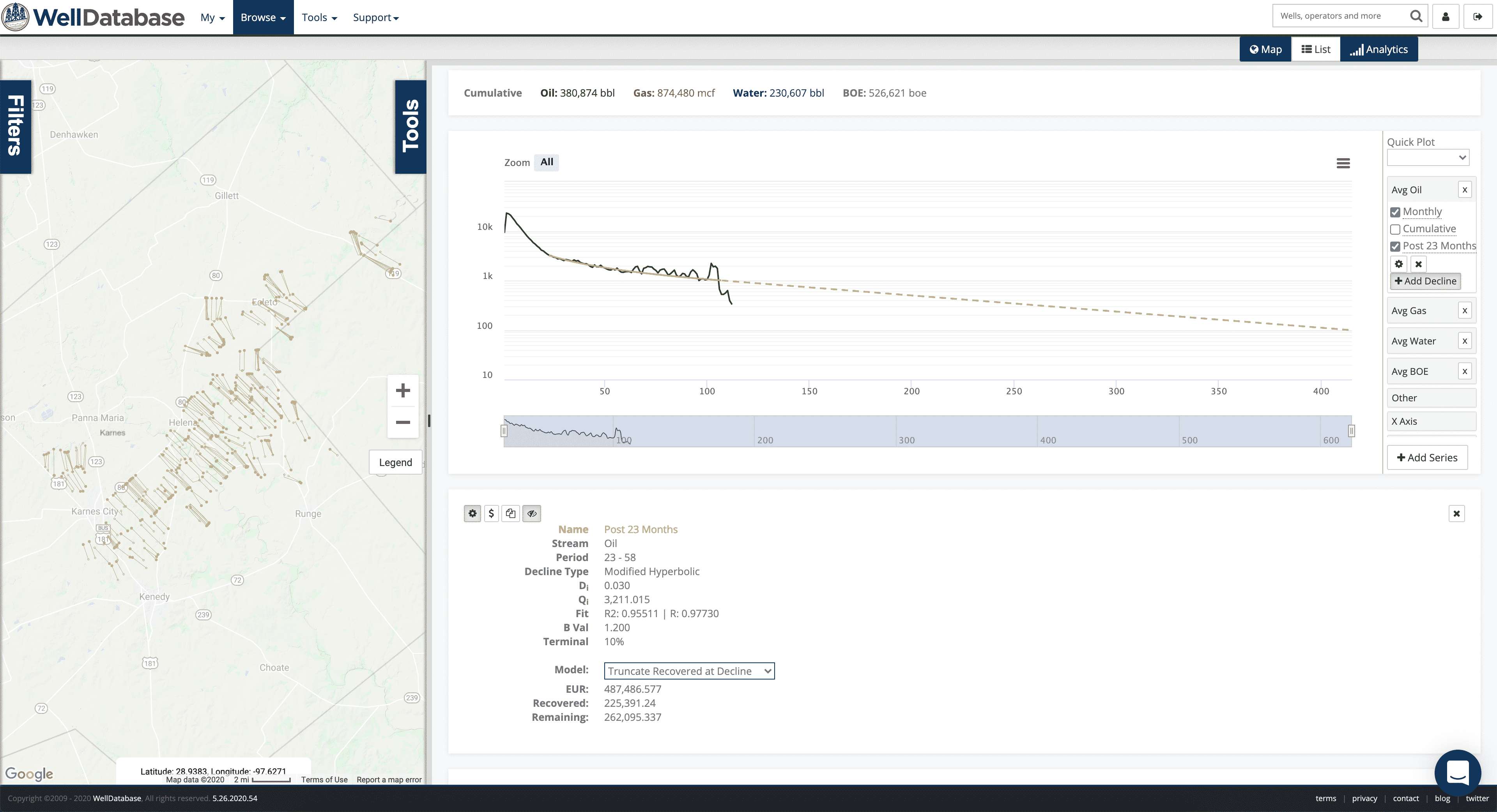
Since the first 23 months fit so tightly, we can actually hide that decline and rely on the actual production to help determine our EUR.
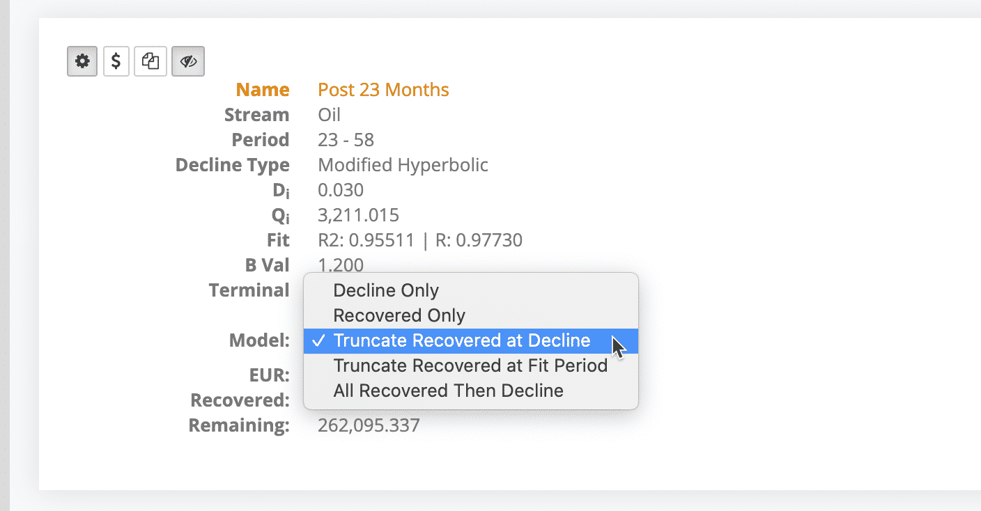
This is the existing production with the trailing decline on. We’ll make one more tweak and add on a 10% terminal decline number.
And there we have it..
Now one last quick thing about the EUR. There are a handful of options to calculate the EUR. Since we want to use the existing production up to our decline and then the decline only afterwards, we need to pick the “Truncate Recovered at Decline” option.
That’s the one.
The ability to create and test multiple fits in WellDatabase is exactly what we needed. It allowed us to generate a solid fit and a usable EUR for what was an inconsistent data set. On top of that, we have a better understanding of the production profile here.
Decline cure analysis tools in WellDatabase are available starting with our Essential package. Sign up and get started generating decline today.
If you want a deeper dive into our decline curve analysis tool, check out our webinar all about it on our YouTube channel.